Phung Thi

Phung Thi

Liquor

Liquor

Liquor

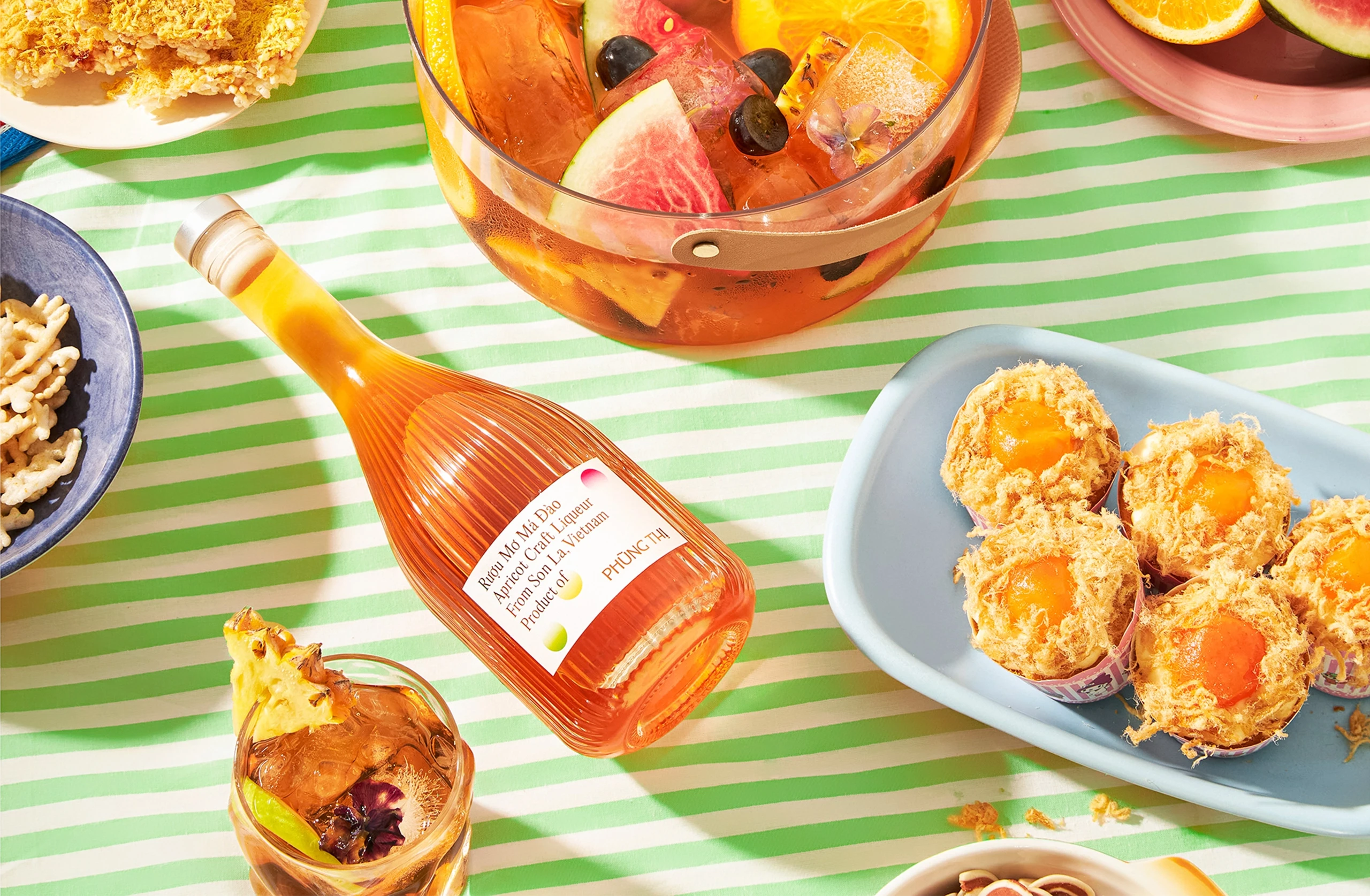
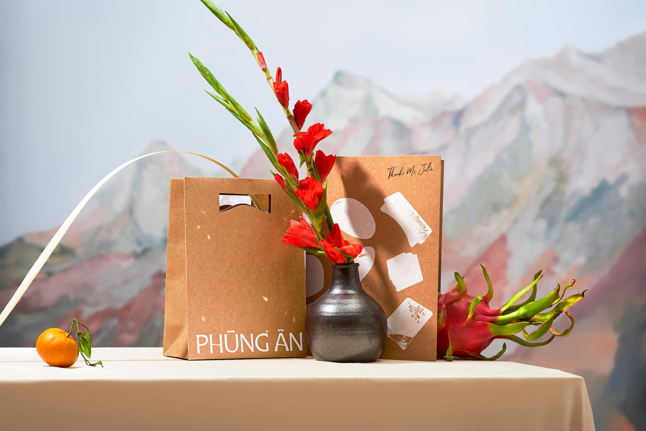
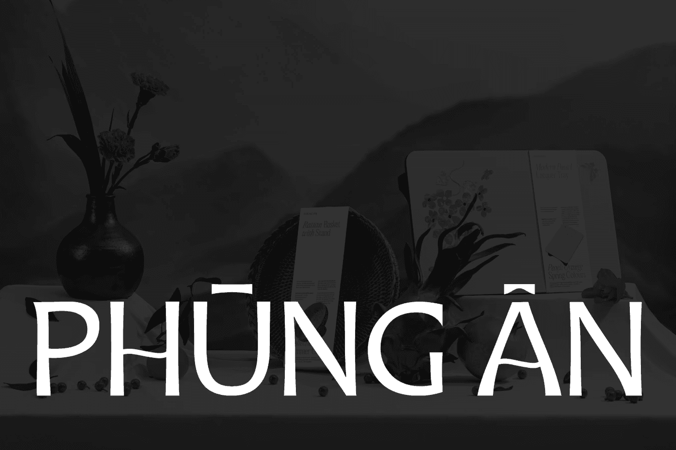
Phung Thi’s apricot liquor celebrates rare Northwest fruits flavour, crafted for joyful sipping and meaningful human connection.

(INTRO)

(01)

The packaging aims to express joy and connection, turning apricot liquor into a meaningful, shareable experience.

The packaging aims to express joy and connection, turning apricot liquor into a meaningful, shareable experience.

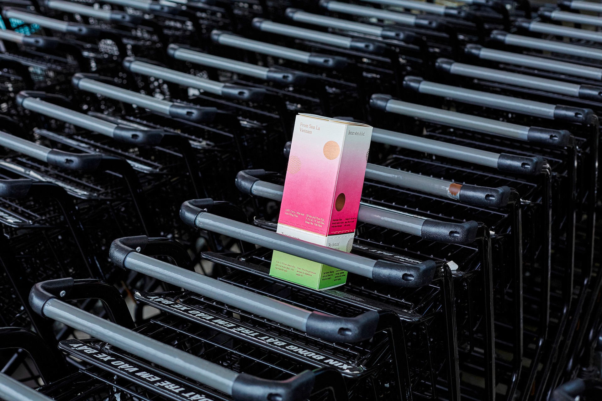
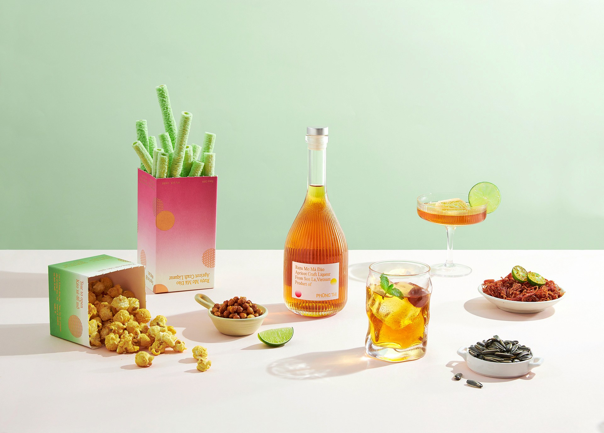
Picture yourself in a landscape where lush green mountains meet a mystical sky, wrapped in gentle mist. The packaging of Phung Thi's Apricot Craft Liquor captures this serene scene, using blended colors and gradients inspired by nature’s elusive beauty. The liquor also reflects the heartfelt dedication of local artisans who handcraft each bottle. It embodies the spirit and heritage of Vietnam’s mountainous regions. Traditional patterns from indigenous textiles and imagery of the “ném pao” ceremony add cultural depth and celebrate the country’s rich identity.

(WHAT WE DID)

(WHAT WE DID)

• Purpose and Vision • Positioning Statement • Audience Personas • Core Values & Behaviors

(STRATEGY)

(02)

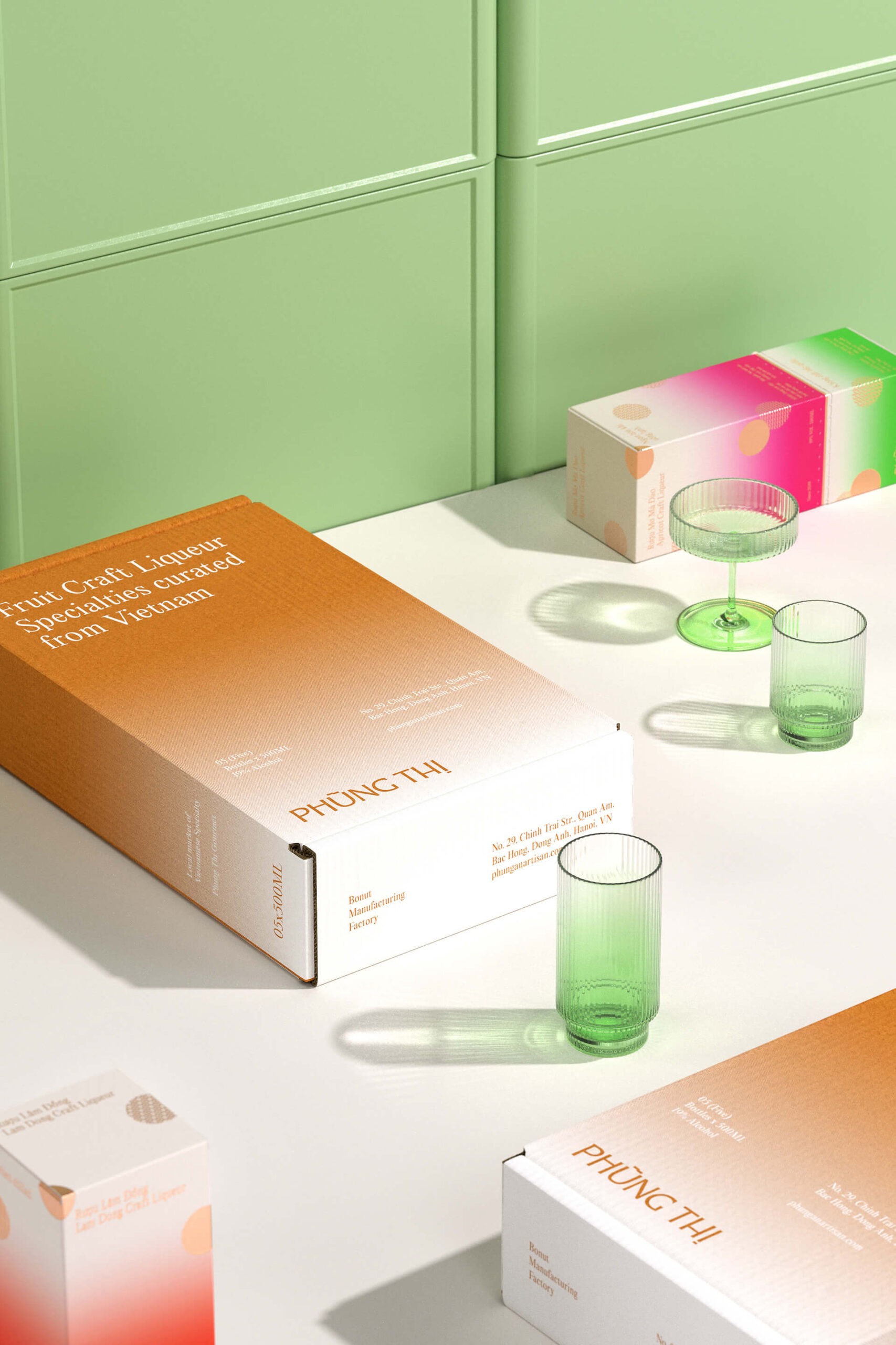
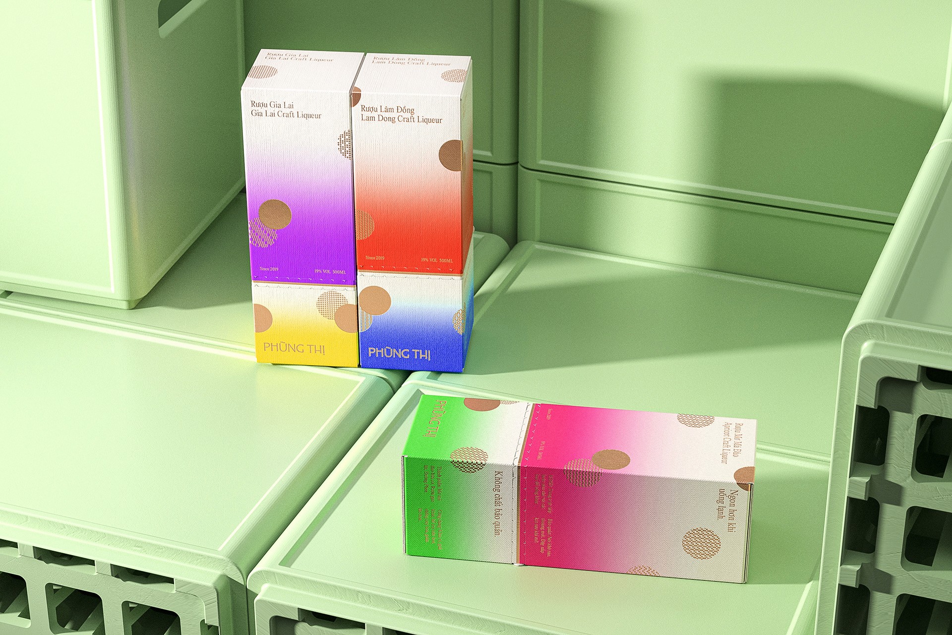
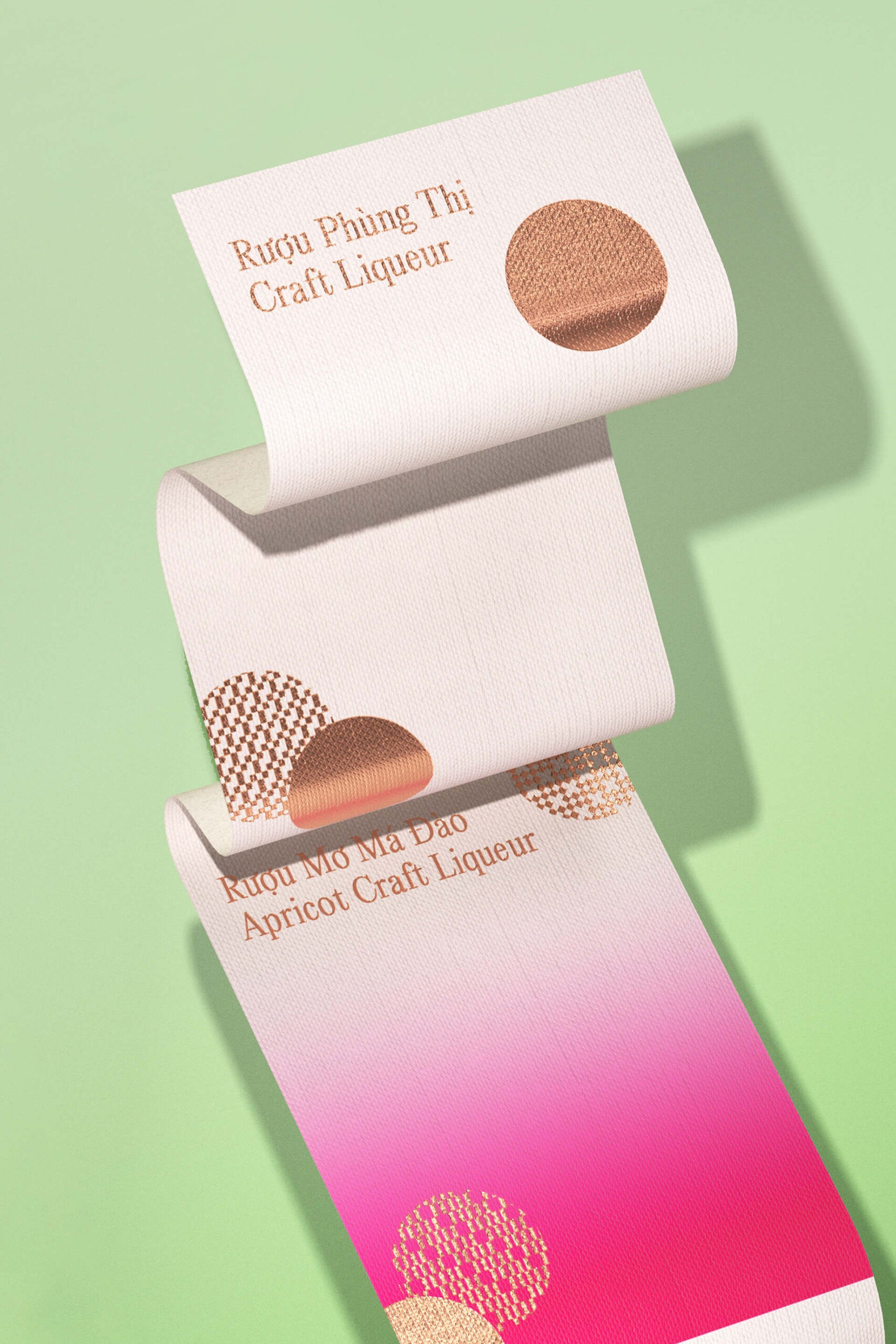
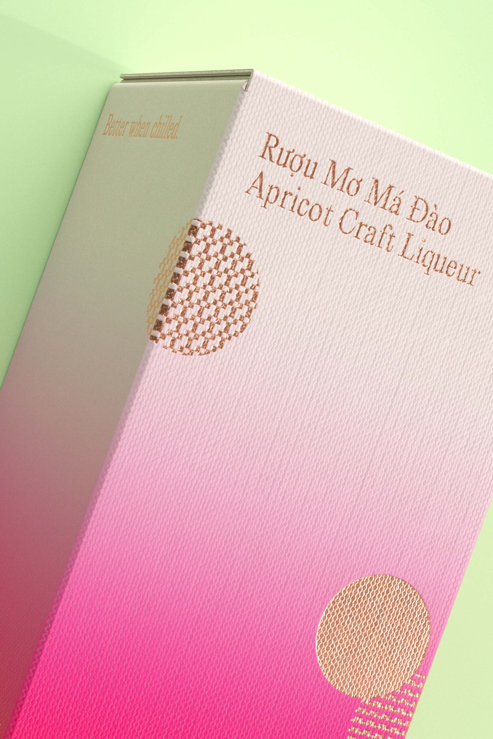
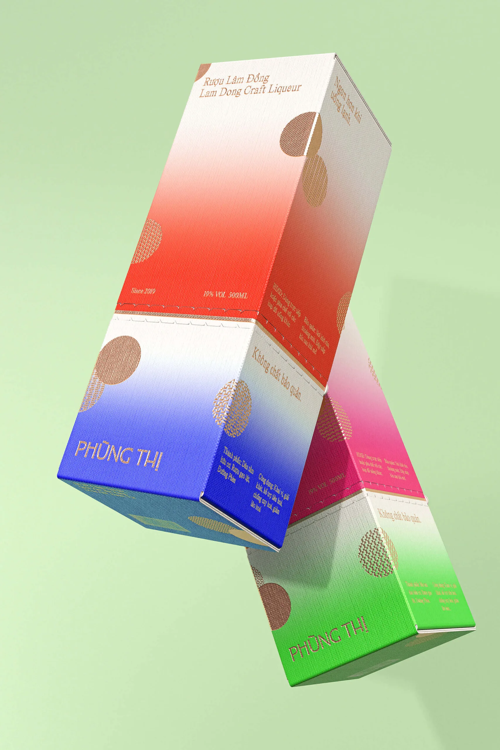
Blending cultural symbolism and modern aesthetics, the packaging design tells a heartfelt story through visuals.

Drawing inspiration from mountainous landscapes, the color palette creates a delicate gradient effect that captures the essence of mist and smoke. The design patterns take inspiration from the intricate border patterns found on traditional garments of Vietnam's ethnic groups. The circular motifs bouncing around the packaging, reminiscent of the "ném pao" ceremony, symbolize love and human connection, evoking joyful imagery and reflecting the vibrant Vietnamese lifestyle. The carefully chosen typography, featuring an elegant serif typeface, adds a touch of sophistication and refinement to the packaging. Combined with the color gradient layers, it creates a modern visual aesthetic. This design approach not only facilitates easy comprehension of the content but also makes the packaging contemporary and engaging.

(visual)

(03)

Merging material storytelling and functional design, the packaging offers a refined yet meaningful unboxing experience.

To evoke the essence of traditional craftsmanship, we have selected linen paper as the canvas for our liquor packaging. The textual content and intricate patterns on the packaging are meticulously stamped in bronze foil, perfectly matching the color of the wine. This seamless integration exudes an air of elegance, while still maintaining a fresh and contemporary appeal. To enhance the unboxing experience, we have incorporated the “perforation” technique at the intersection of the gradient layers, coupled with delicate bronze foil stamping to draw attention. By tearing the perforated section, the wine box effortlessly splits into two halves, each capable of holding snacks alongside your wine, promoting sustainability and providing a multi-functional user experience.

(visual)

(End)

Layơ Lab learned that authentic local stories, when told through thoughtful design, create powerful emotional resonance.

(WHO WE ARE)

Creative Director: Alex Dang Designer: Truong Thanh Account Manager: Hang Nguyen 3D Visualizer: Duy Tran

(WHO WE COLLAB WITH

Photography: anchoicreative, h.tungf, Ngô Thành Hữu Print Producer: Phung Thi

(End)

(SCroll < > to show)

PhungAn Test

PhungAn Test

PhungAn Test

Phung An Website

Phung An Website

Phung An Website

Phung An Artisan 2

Phung An Artisan 2

Phung An Artisan 2

Hopen.Co222 Website

Hopen.Co222 Website

Hopen.Co222 Website

Hopen.Co

Hopen.Co

Hopen.Co

( SUBSCRIBE )

LAYƠ LAB

© LAYO LAB | 2022 - 2025

© STUDIO

( SUBSCRIBE )

© LAYO LAB | 2022 - 2025

( SUBSCRIBE )

LAYƠ LAB

©

Studio