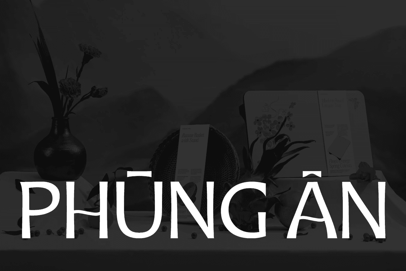
Phùng Ân delivers sustainable, modernized handcrafted gifts that celebrate Vietnamese heritage and support artisans.
(INTRO)
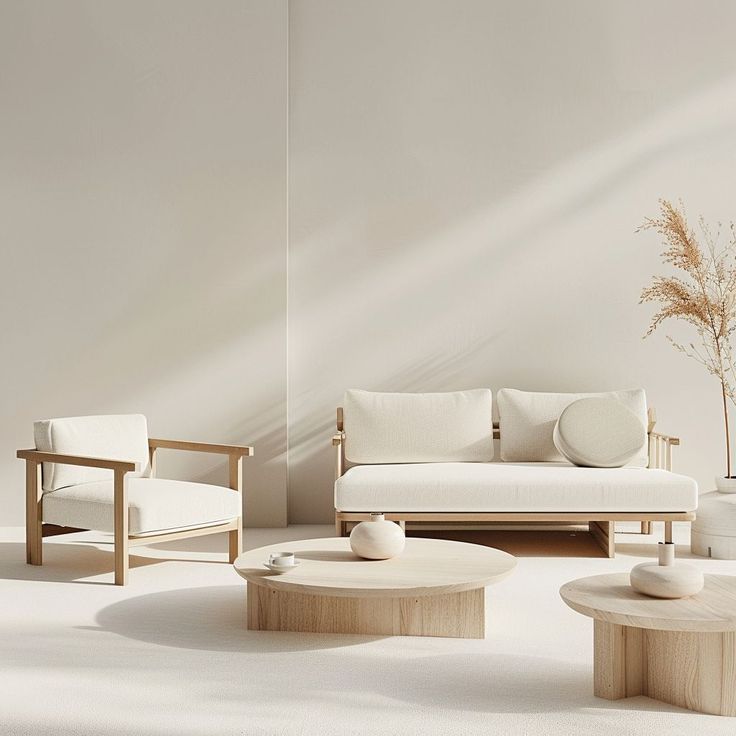
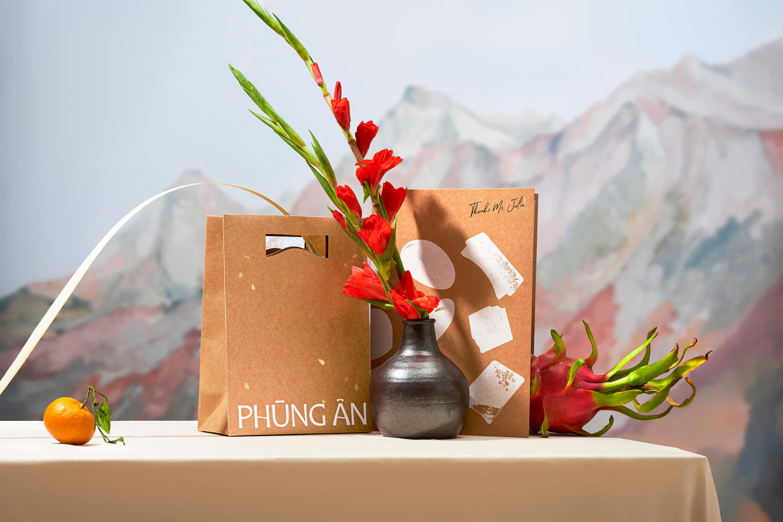
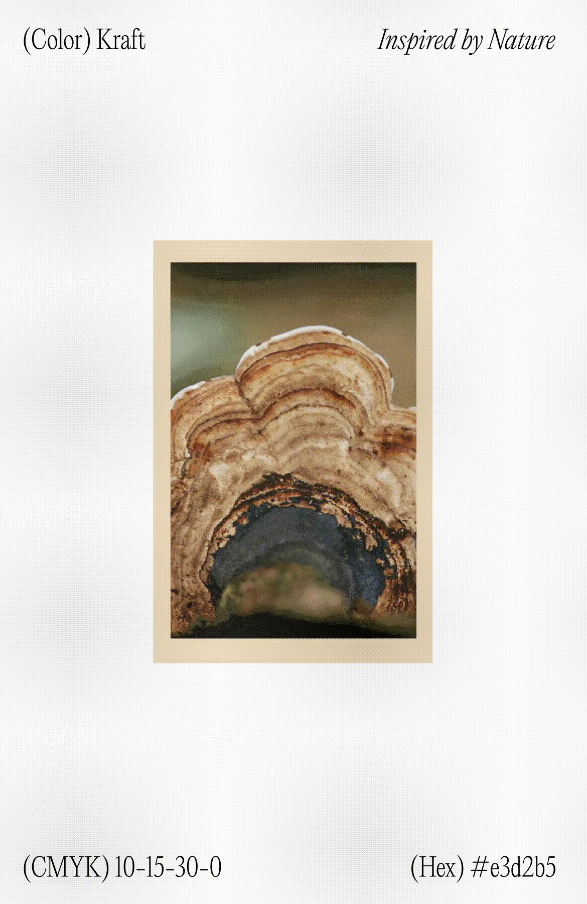
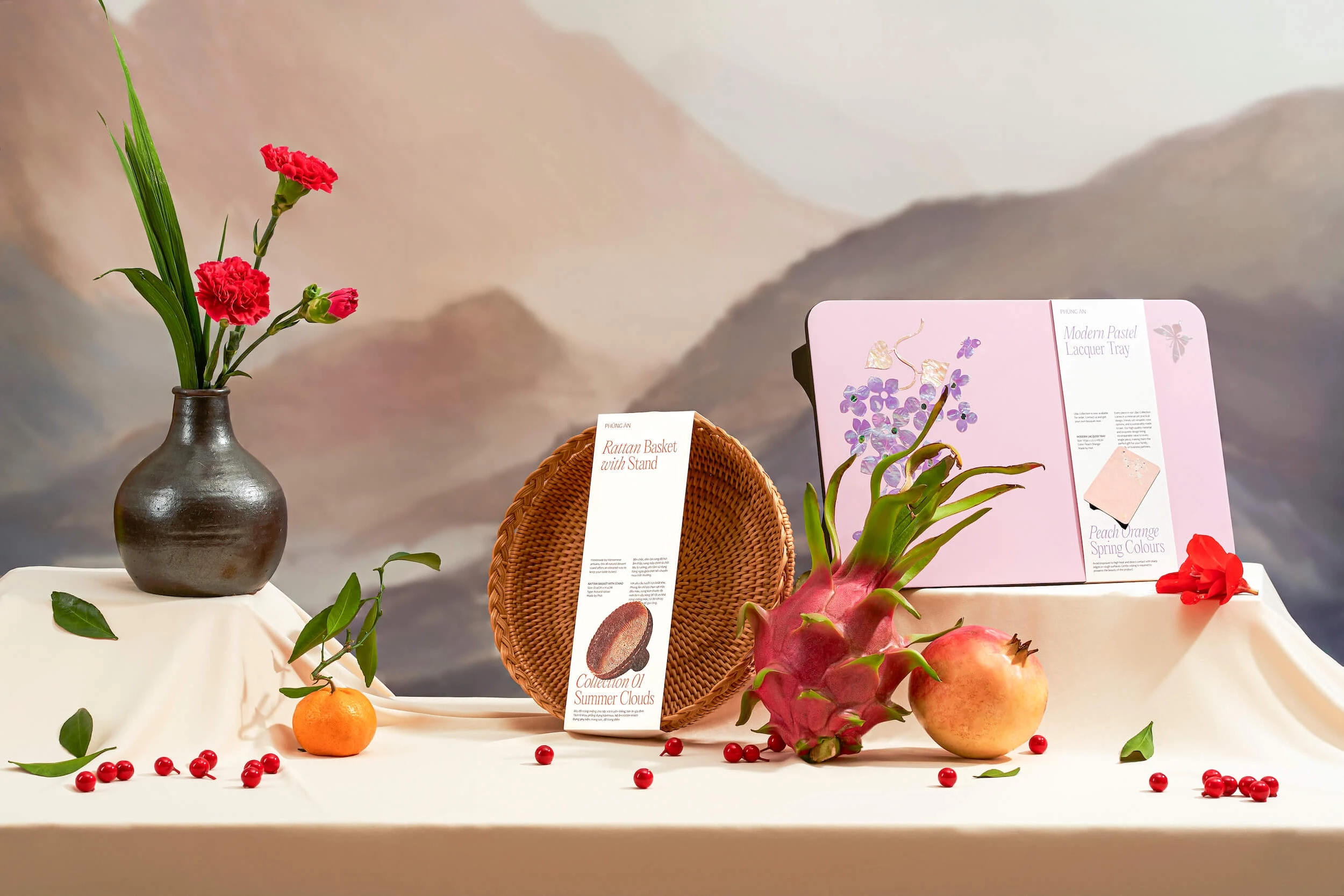
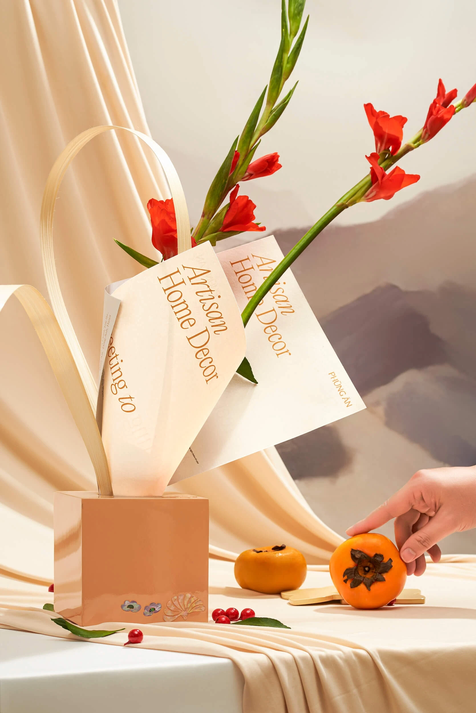
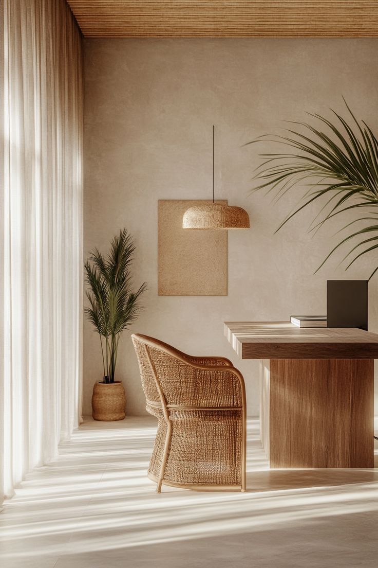
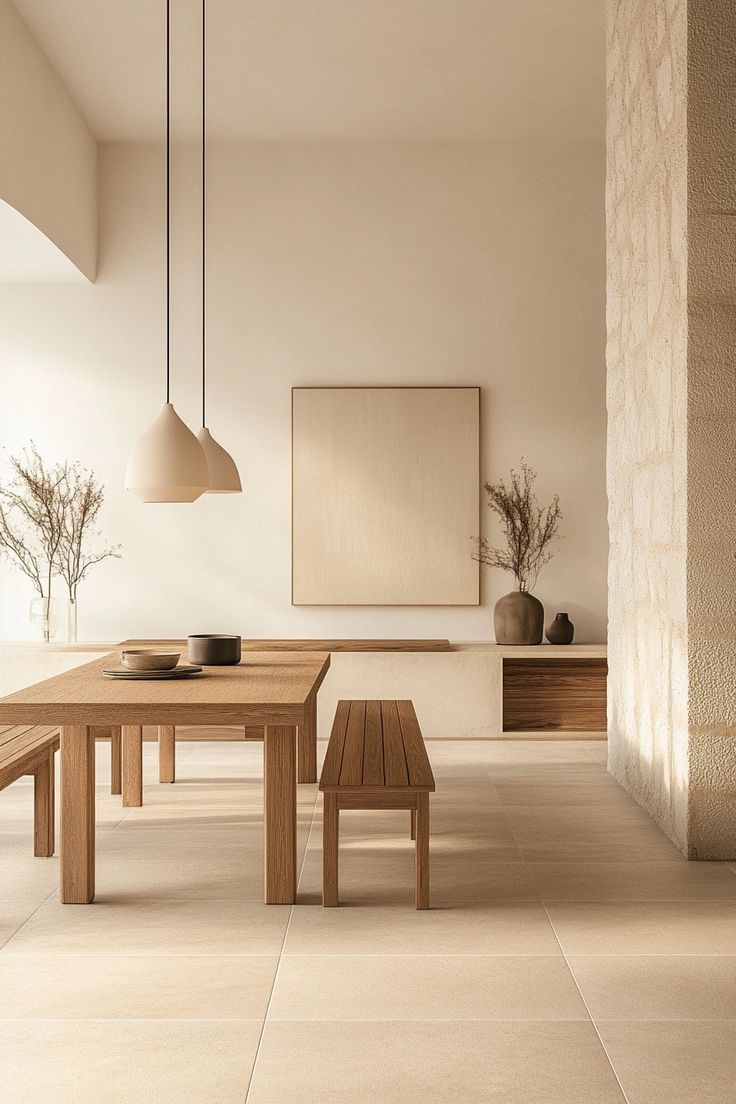
Phùng Ân collaborated with Layơ Lab to revamp its brand, aiming to unify its visual identity while affirming professionalism, modernity, and creativity. The research began with humble, everyday perspectives drawn from the working lives of Vietnamese artisans and craft villages, providing rich inspiration for the design concept. By incorporating traditional yellow tones from ochre soil, bamboo, ebony wood, and eco-friendly Kraft paper, we sought to preserve and elevate the rustic beauty of Vietnamese handicrafts. These materials also appear in Phùng Ân’s packaging, reinforcing the link between form and meaning. This visual approach celebrates Vietnamese craftsmanship in a contemporary context, shaping the identity of Phùng Ân Artisan as one that “presents Vietnamese heritage to the future.”
• Indicate brand needs and problems • Analyze brand's business strategy • Analyze brand's target customer cknjsncksjdc • Research brand concept sdcsdcdscsdc
(STRATEGY)


Layơ Lab’s “Golden Dust Of Time” concept is the revival of Vietnamese artisan's brilliance in a modern life.
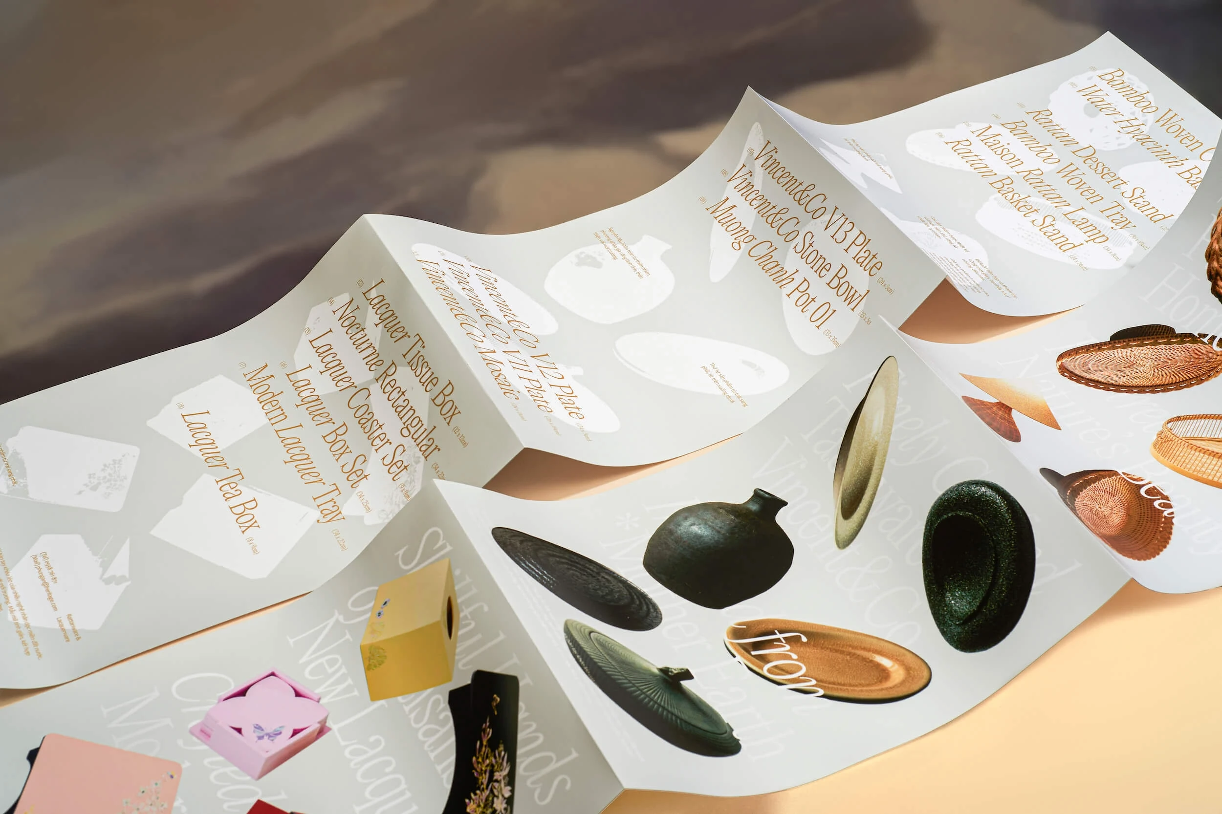
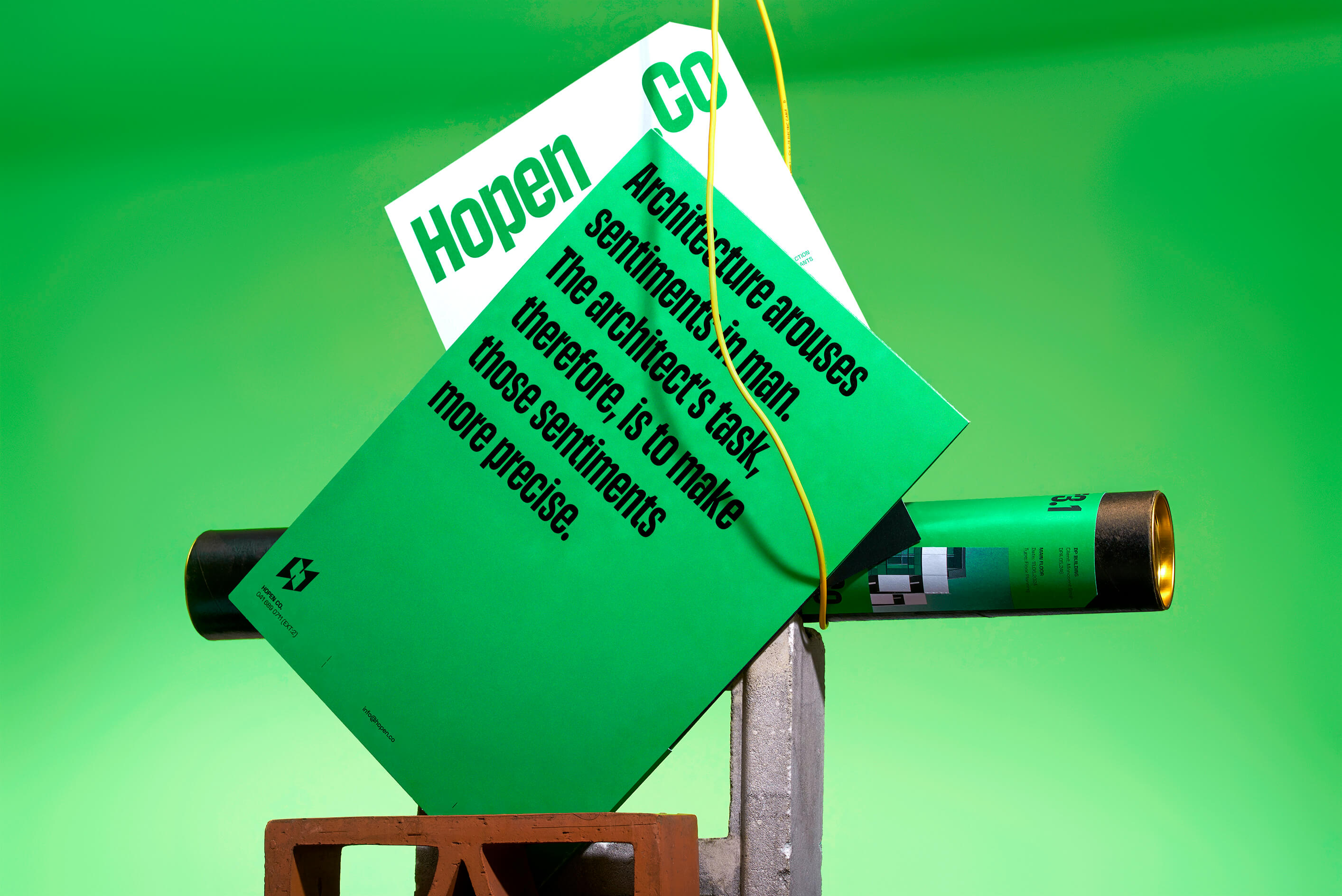
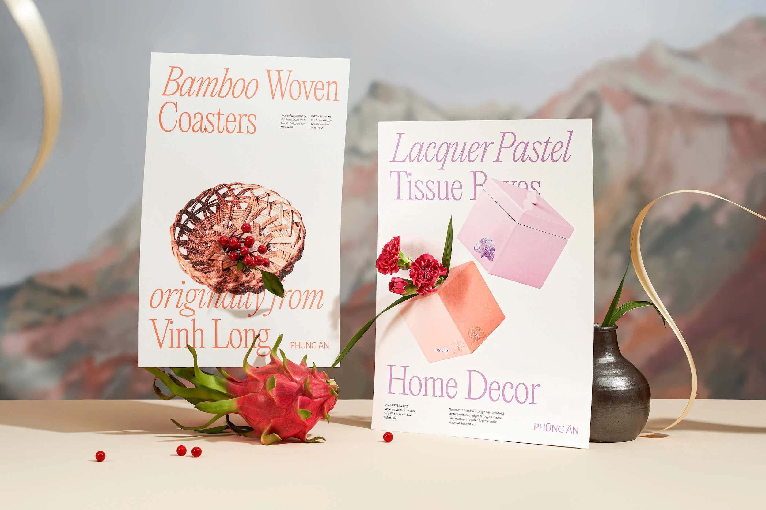
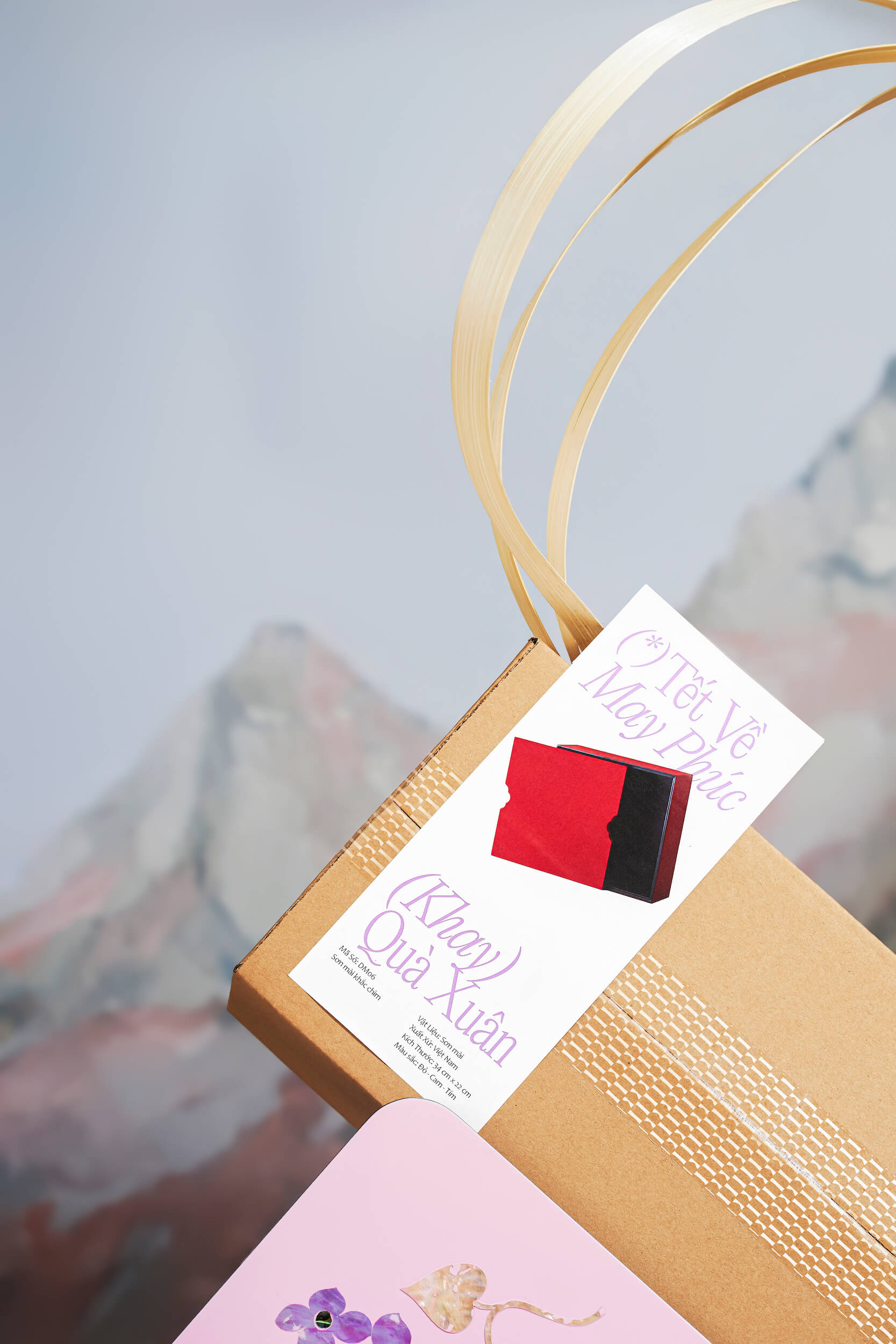
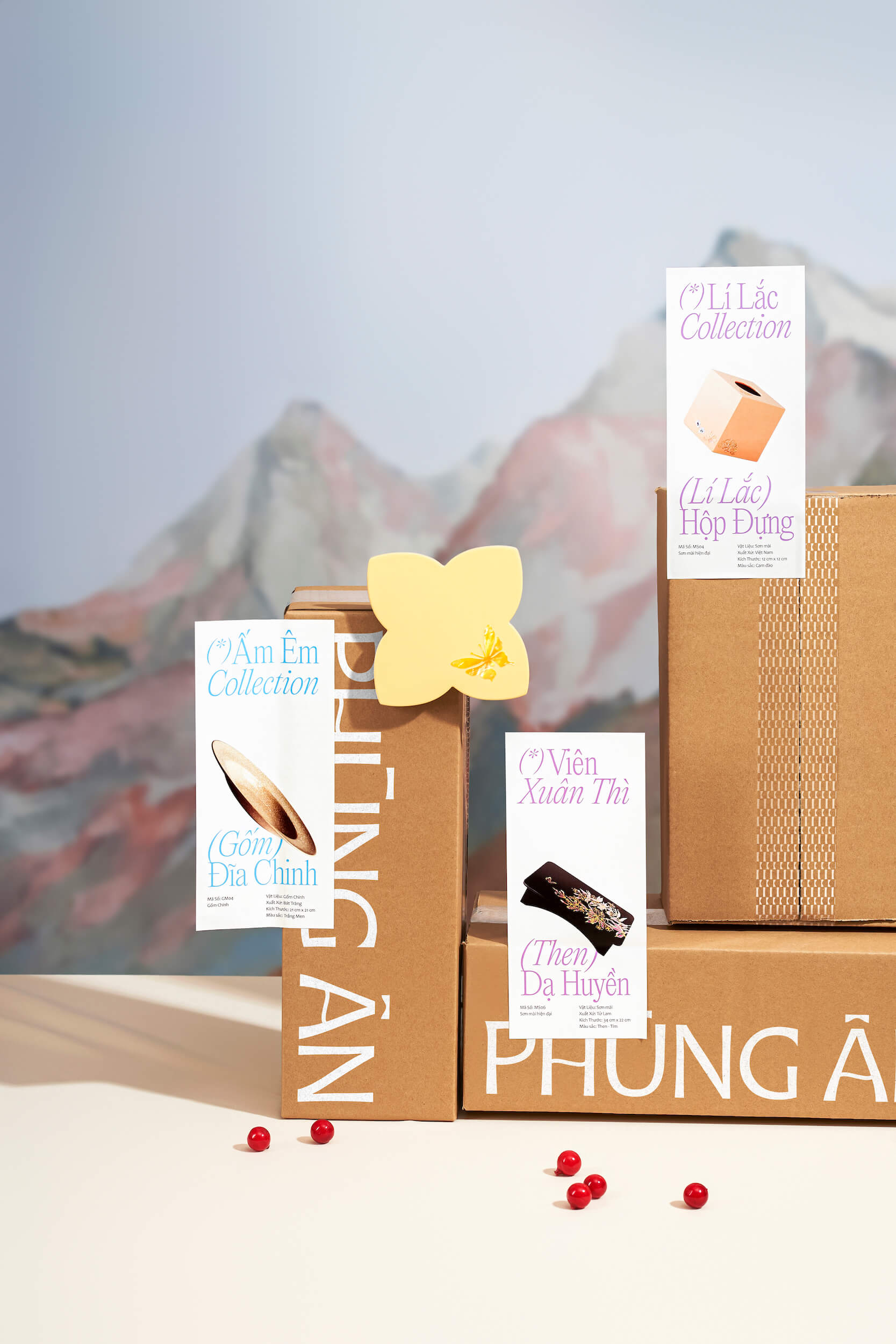
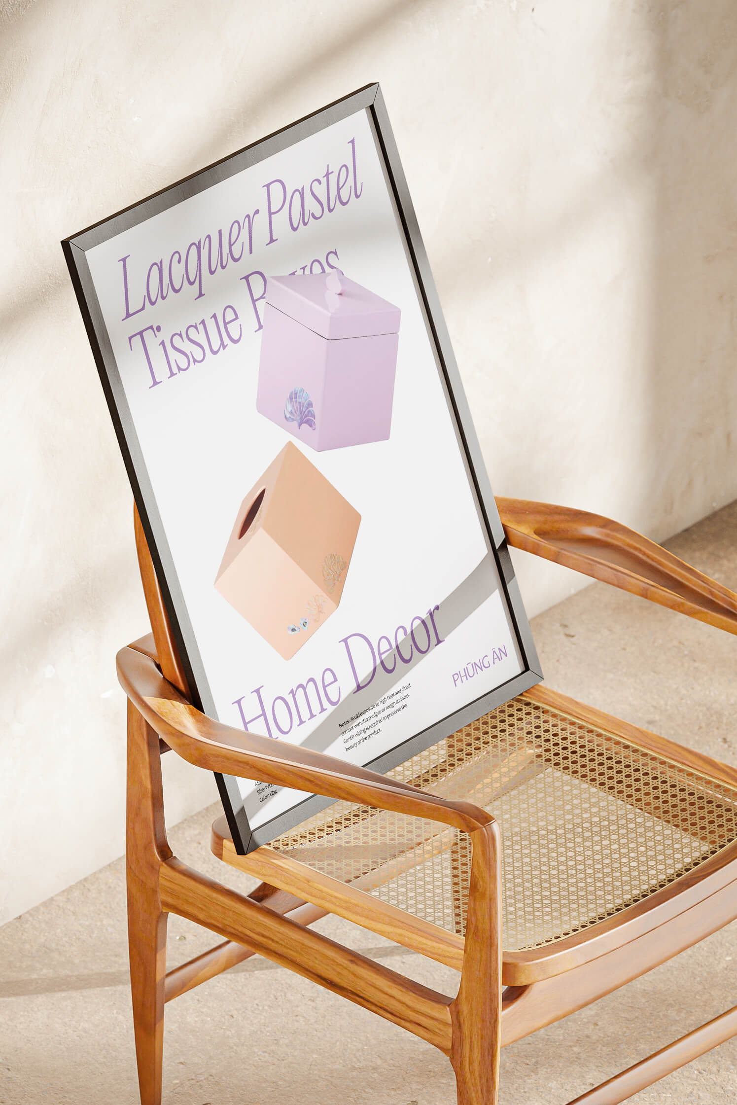
To reinforce sustainability and celebrate craftsmanship, the key visual “Gold Dust” was introduced, symbolized by irregular gold foil patches embedded in layouts. Representing the timeless value of heritage, it adds depth and sophistication to the brand. These golden accents reflect Phùng Ân’s premium quality while evoking the artisan spirit in a contemporary form. With customizable size, spacing, and tone, “Gold Dust” adapts flexibly across platforms, preserving artistic elegance. We furthur affirm the brand’s commitment to sustainability and traditional craftsmanship, “Gold Dust” serves as a core visual element. Its random-shaped gold foil patches integrate layers of imagery and content, enhancing the sense of heritage and refinement. These details can be tailored in scale, position, and color, offering both visual consistency and creative adaptability across brand touchpoints.
(visual)

Layơ Lab infuses new vitality into the world of Vietnamese artisanry.
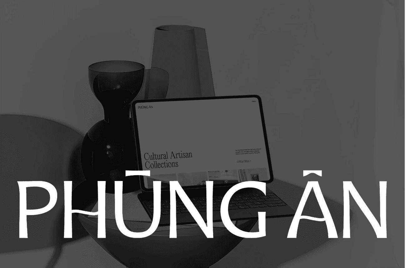
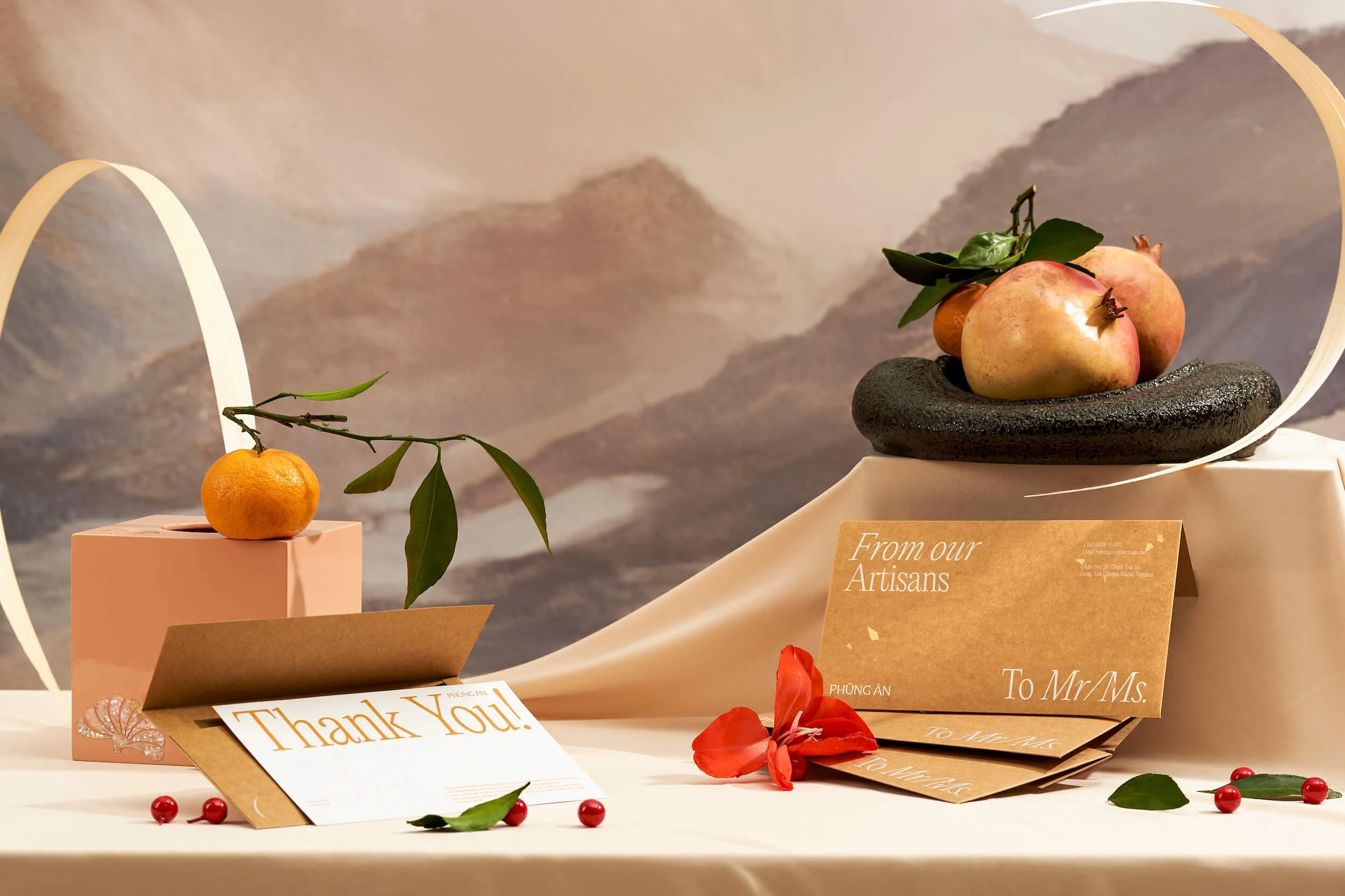
To bridge tradition with modern artistry and highlight Phùng Ân’s sustainability ethos, the identity system uses handmade Kraft paper with white printing—bringing a sense of sophistication and contemporary appeal. This solution is cost-efficient while enhancing visual impact and brand uniqueness. The “Gold Dust” effect on Kraft paper adds a soft, meaningful touch, evoking heritage while introducing a fresh, modern approach. Applying gold foil to both text and background enriches layout layers and adds depth to the design. Text is vertically layered with generous spacing, creating a minimalist and elegant look. The high-contrast typography ensures clarity and coherence, focusing on delivering concise, impactful messages. Italicized Editorial New typeface is used to highlight keywords, adding a distinct and engaging visual rhythm.
(visual)


We furthur affirm the brand’s commitment to sustainability and traditional craftsmanship, “Gold Dust” serves as a core visual element. Its random-shaped gold foil patches integrate layers of imagery and content, enhancing the sense of heritage and refinement. These details can be tailored in scale, position, and color, offering both visual consistency and creative adaptability across brand touchpoints
By incorporating traditional yellow tones from ochre soil, bamboo, ebony wood, and eco-friendly Kraft paper, we sought to preserve and elevate the rustic beauty of Vietnamese handicrafts. These materials also appear in Phùng Ân’s packaging, reinforcing the link between form and meaning. This visual approach celebrates Vietnamese craftsmanship in a contemporary context, shaping the identity of Phùng Ân Artisan as one that “presents Vietnamese heritage to the future.” 12
vythyhyhv


We furthur affirm the brand’s commitment to sustainability and traditional craftsmanship, “Gold Dust” serves as a core visual element.
We furthur affirm the brand’s commitment to sustainability and traditional craftsmanship, “Gold Dust” serves as a core visual element. Its random-shaped gold foil patches integrate layers of imagery and content, enhancing the sense of heritage and refinement. These details can be tailored in scale, position, and color, offering both visual consistency and creative adaptability across brand touchpoints
ncjsd cdsc


These details can be tailored in scale, position, and color, offering both visual consistency and creative adaptability across brand touchpoints
We furthur affirm the brand’s commitment to sustainability and traditional craftsmanship, “Gold Dust” serves as a core visual element. Its random-shaped gold foil patches integrate layers of imagery and content, enhancing the sense of heritage and refinement. These details can be tailored in scale, position, and color, offering both visual consistency and creative adaptability across brand touchpoints
csmn dcc


(Rob Meng, CEO)
“Motto® spent the time to dig in and understand our soul. They understood our aspirations and how to tell our story. They are such an inspired team to work with and a great process to go through. They had perfect project management with clear timelines, expectations, and communication. We had a wonderful collab.”