Bringing the cool clarity of the North into the warmth of everyday life in Vietnam.
(CHALLENGES) The challenge was not simply to “make a café look better,” but to bring the refreshing, refined spirit of the Nordic region into the heat of Ho Chi Minh City while preserving the warmth and familiarity of a place people would return to every day. Layơ Lab developed a minimal yet expressive identity system, connecting the values of Fresh, Quality, and Thoughtful with a contemporary Scandinavian spirit that creates a brand that feels international and refined while remaining relevant to everyday life in Vietnam.
• Brand Strategy • Core Identity • Visual System • Brand Applications


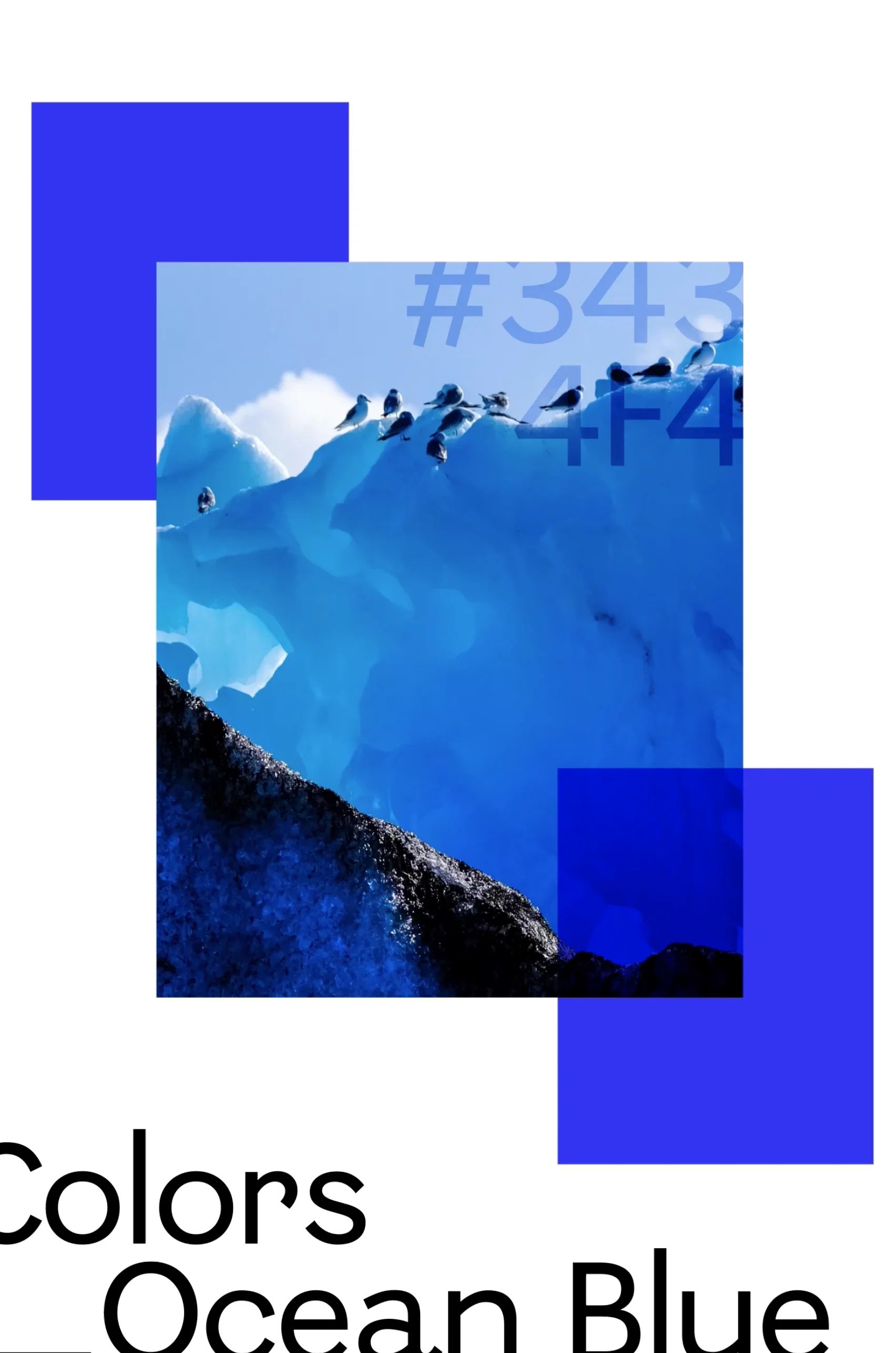
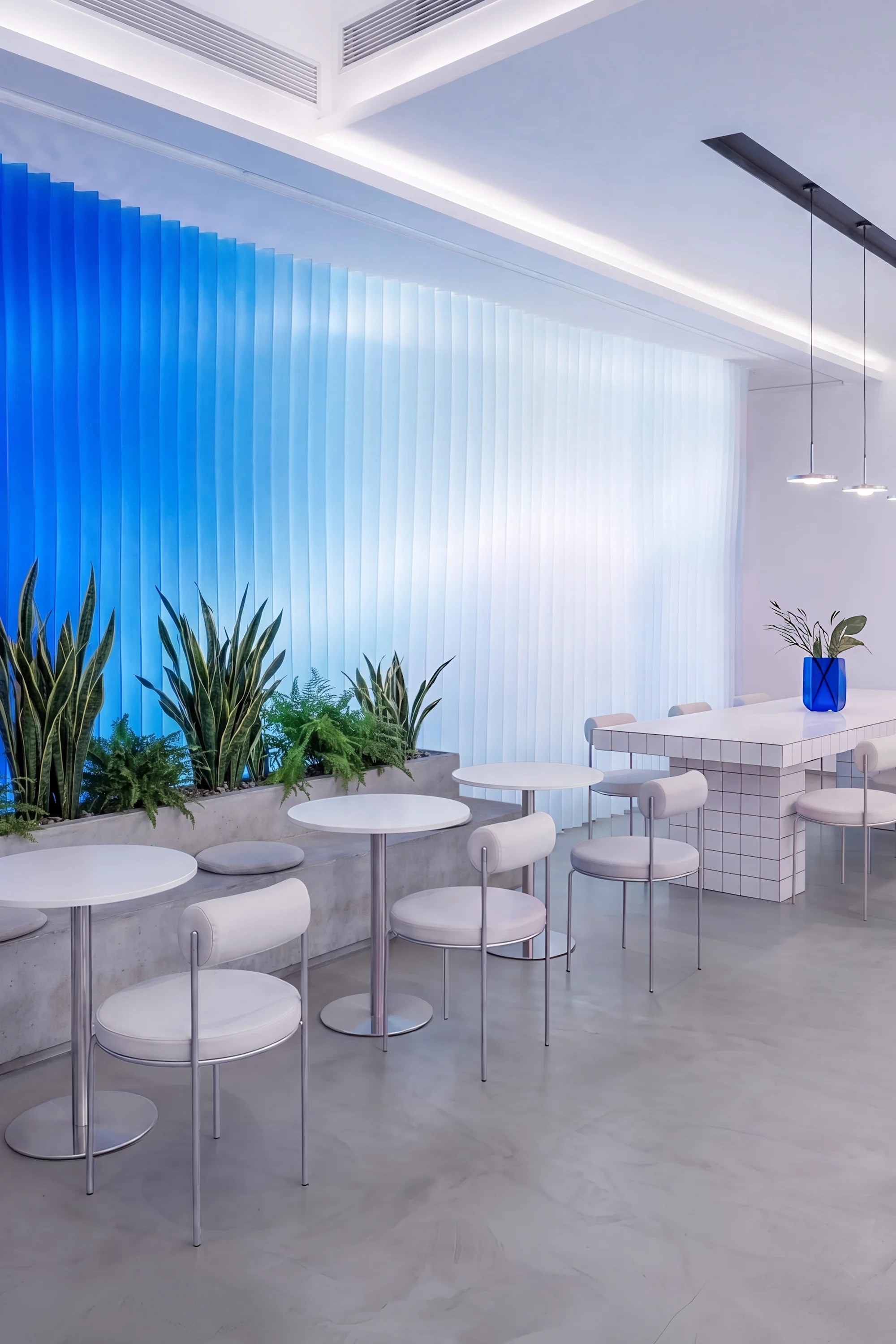
The concept “The Nordic Breeze” brings the refreshing spirit of Nordic ice and snow into the heart of the tropics, creating a fresh pause within the everyday lives of TATA’s customers.
(STORY) TATA’s Scandinavian spirit is expressed through visual cues, symbols, and characteristics inspired by the landscapes of the North. If Scandinavia represents minimalism, refinement, and pure icy landscapes, Ho Chi Minh City is defined by heat, energetic rhythms, and the warmth of human interaction. TATA chooses to exist between these two worlds: drawing from Minimalism design to express international sophistication, while retaining the warmth of a familiar place where people can enjoy the moment.
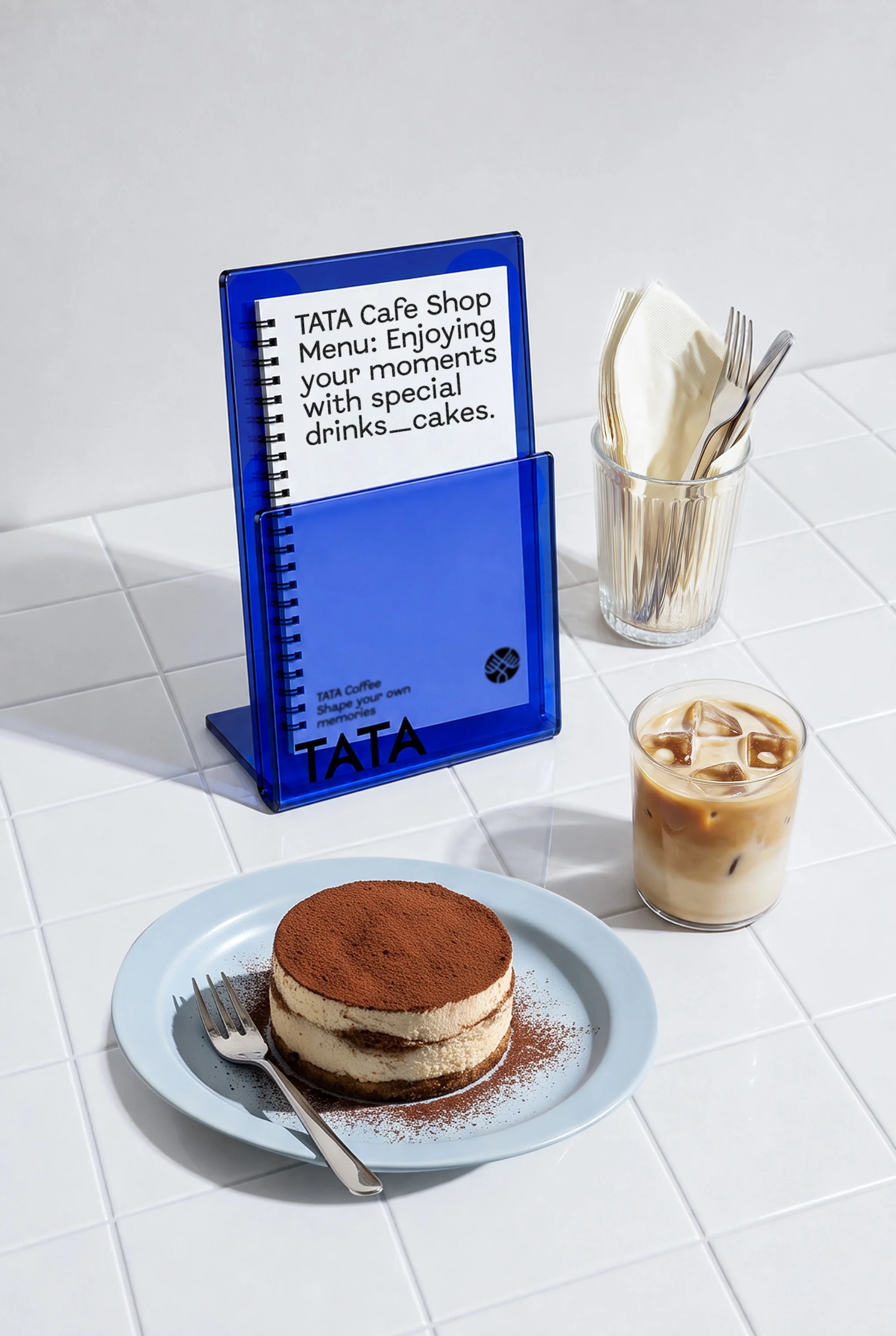
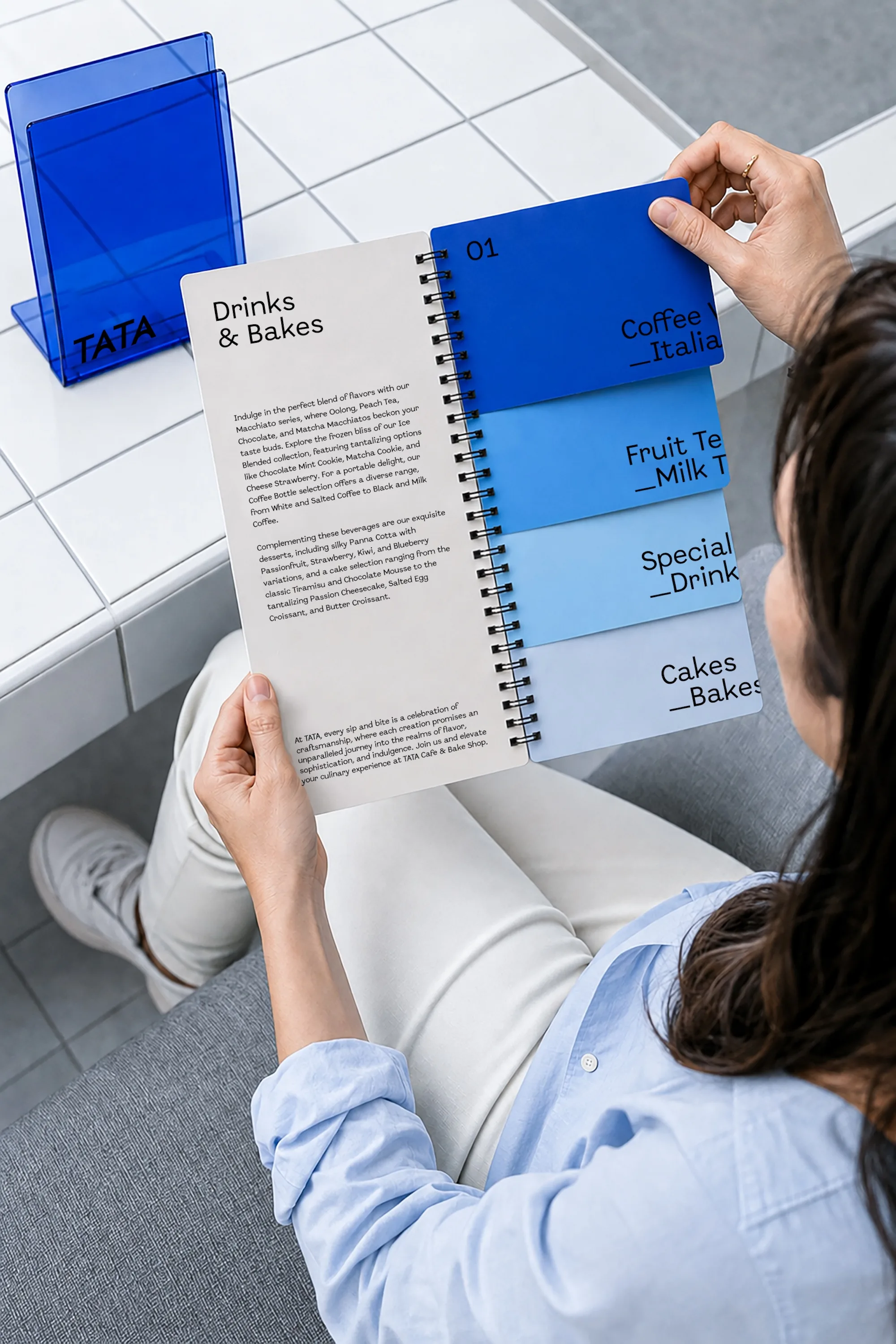
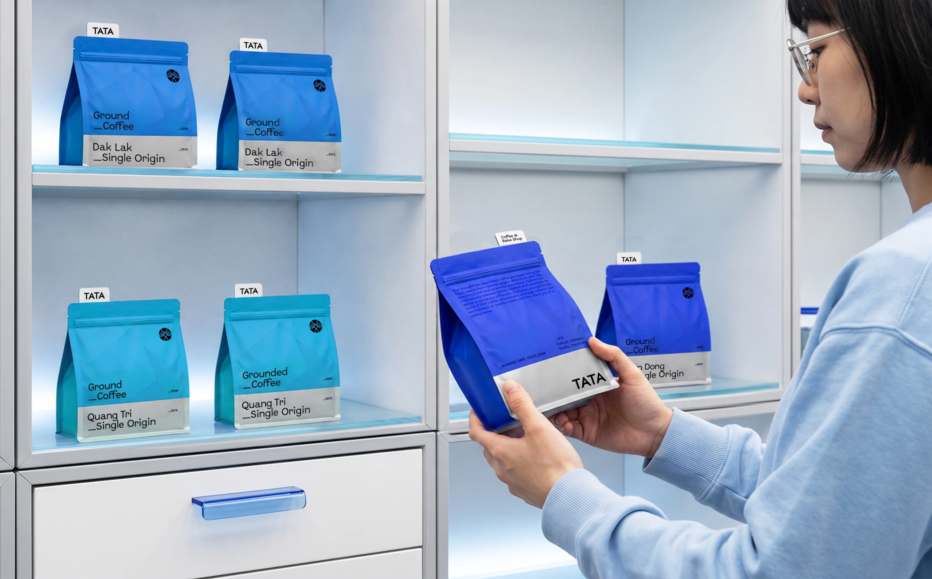
TATA’s identity system is built on a foundation of Minimalism and Scandinavian design refined enough to communicate sophistication, yet simple and accessible enough for everyday life.
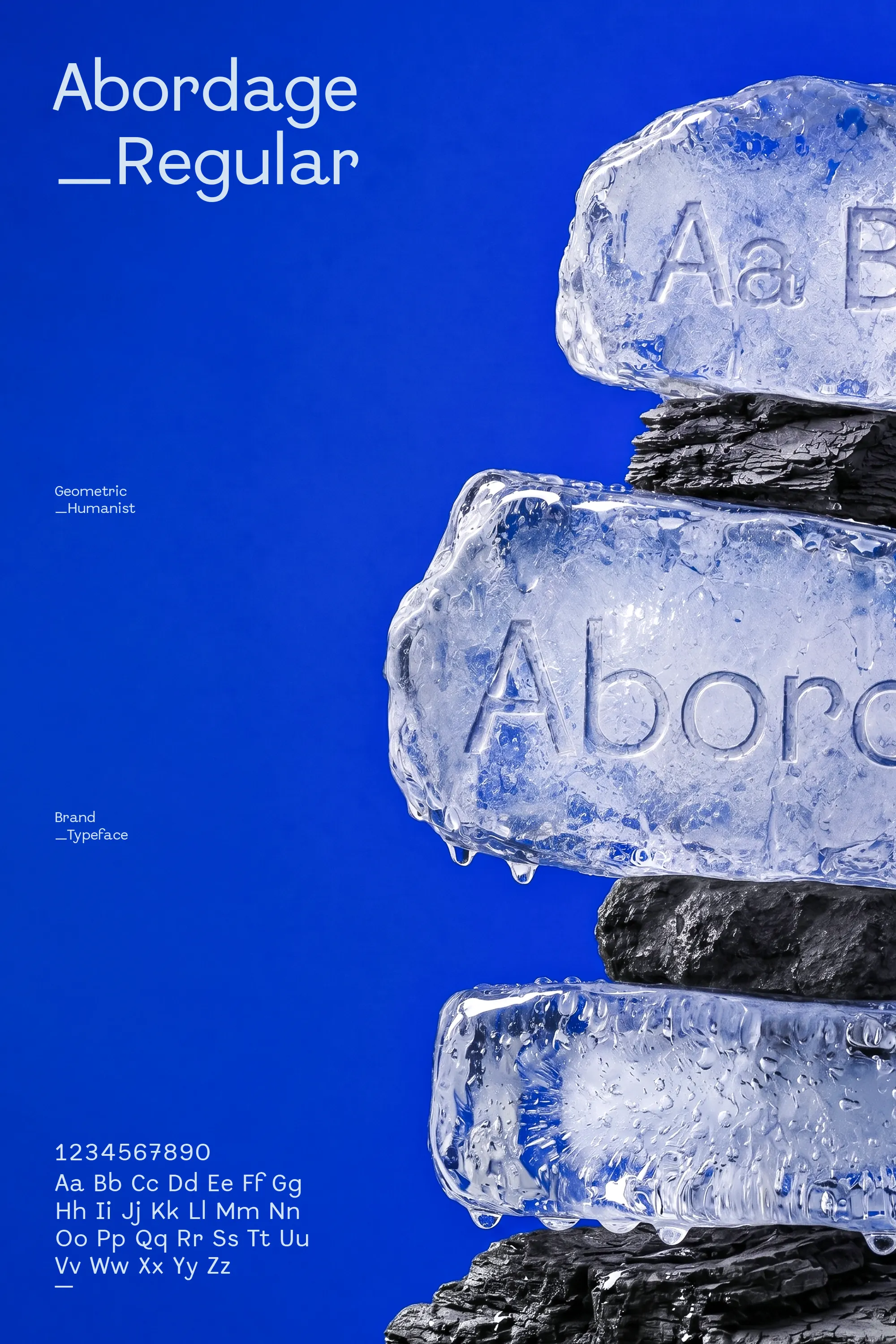
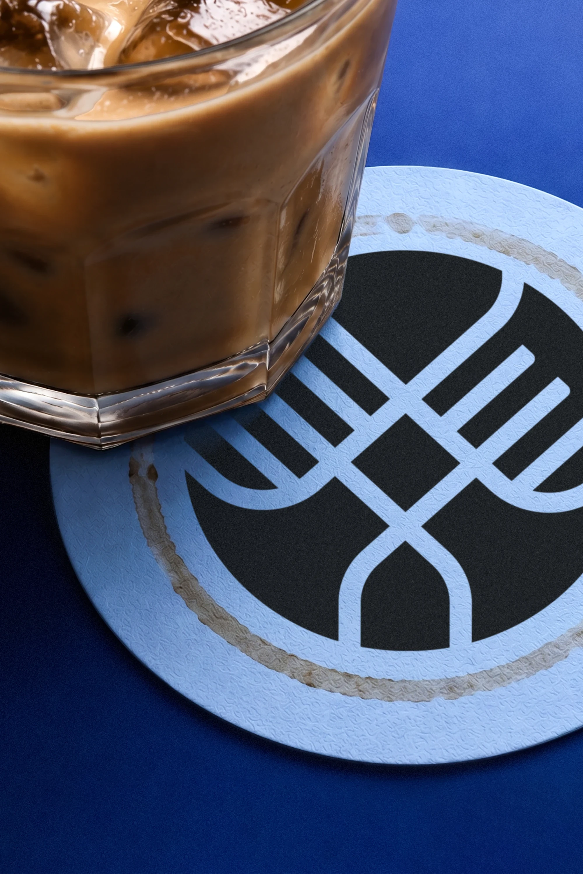
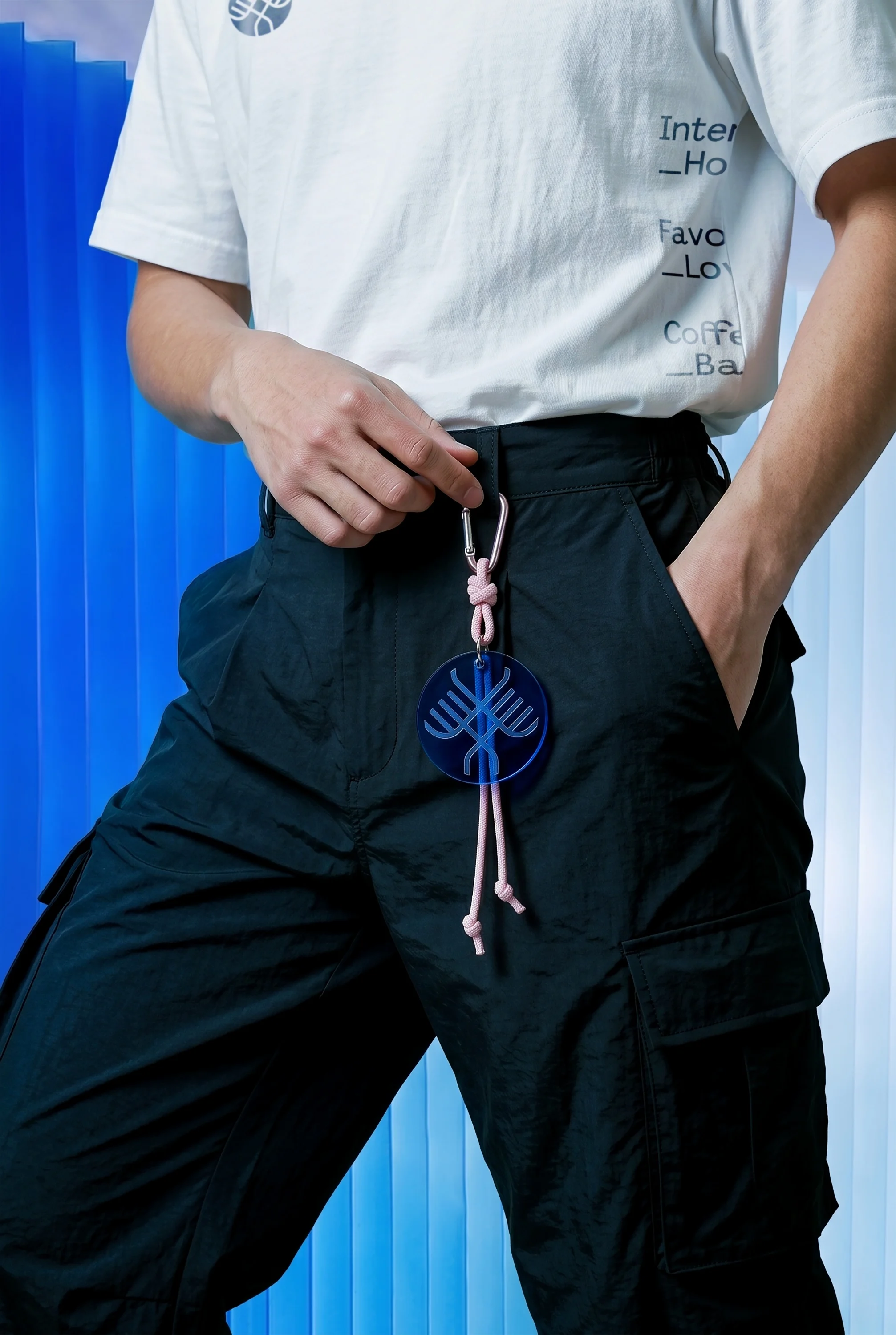
(IDENTITY) Inspired by traditional Nordic Runes, the TATA logomark form also evokes a deer with large antlers, connected to the culture and nature of the Nordic region. The two “A” characters of the logotype are treated as north-pointing compasses, while their continuous curved crossbars evoke layers of Nordic mountains. A blue-led color palette (drawn from ice, sea, and snow) brings a refreshing sense of coolness into the heat of HCMC. The distinctive yet highly legible Abordage typeface complements the system across taglines and brand applications.
(Key features)
• Nordic Rune-inspired emblem logomark • Neo-Grotesk compass-inspired logotype • Ice, sea & snow blue color palette • Distinctive, highly legible typography system

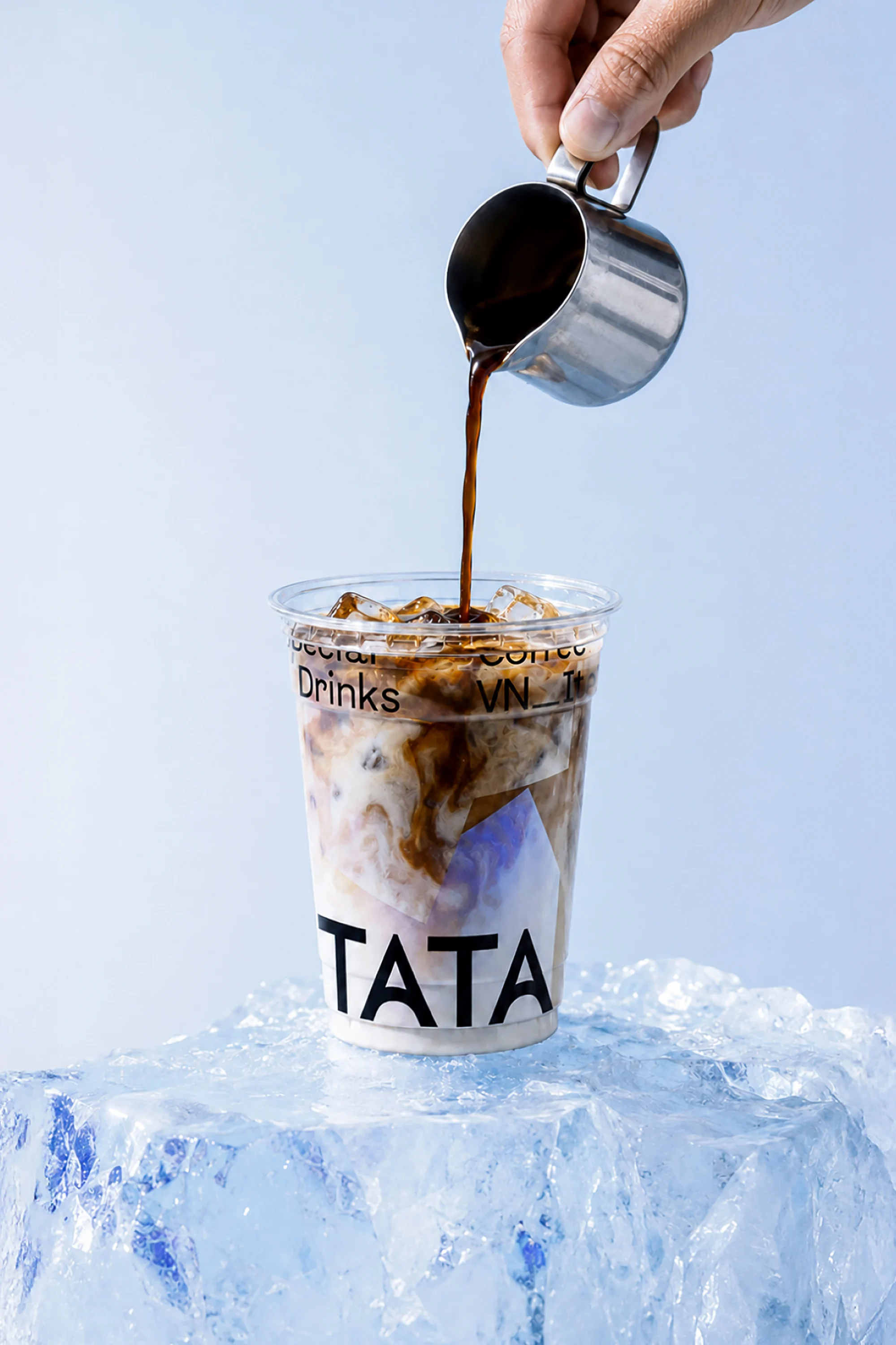

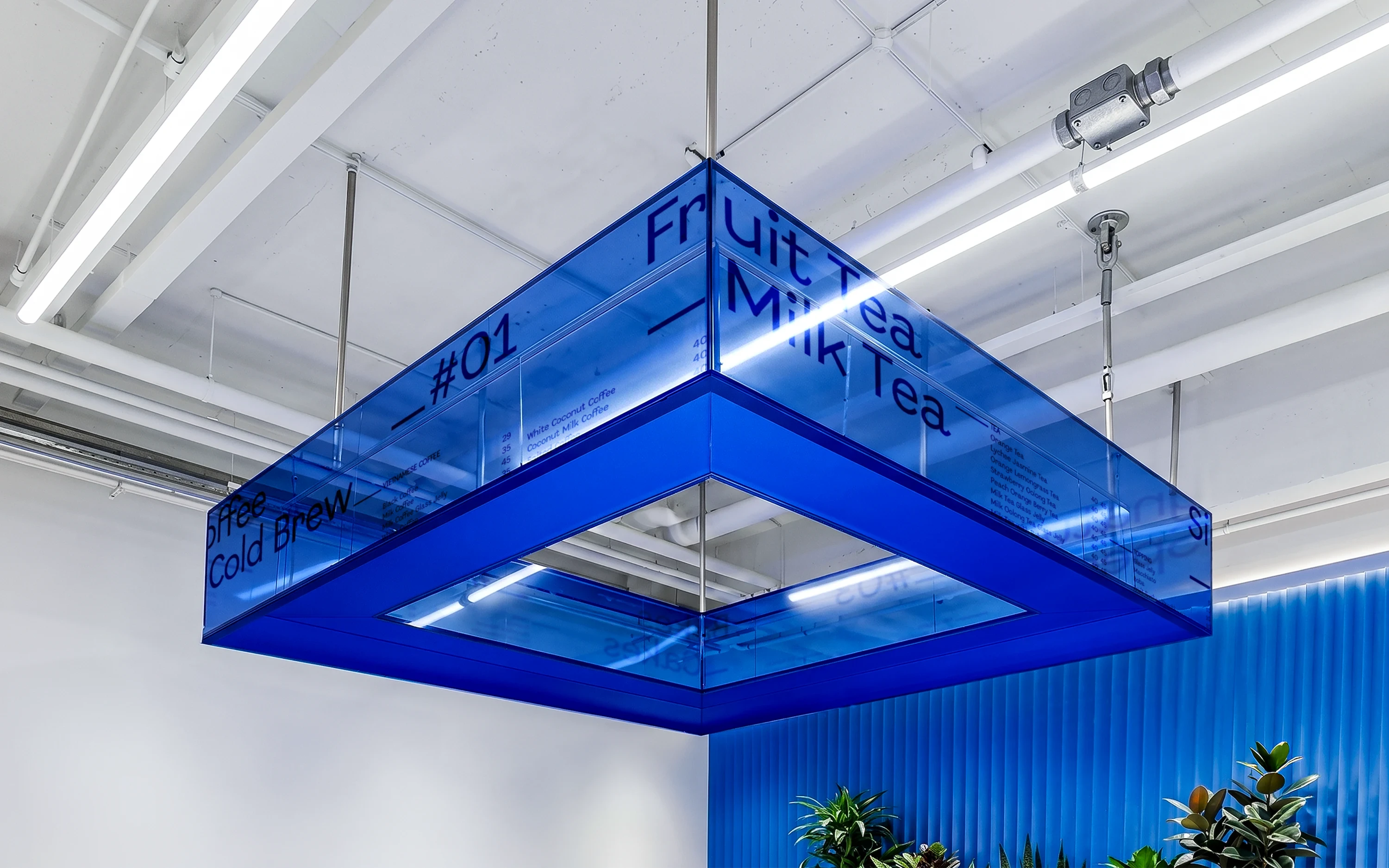
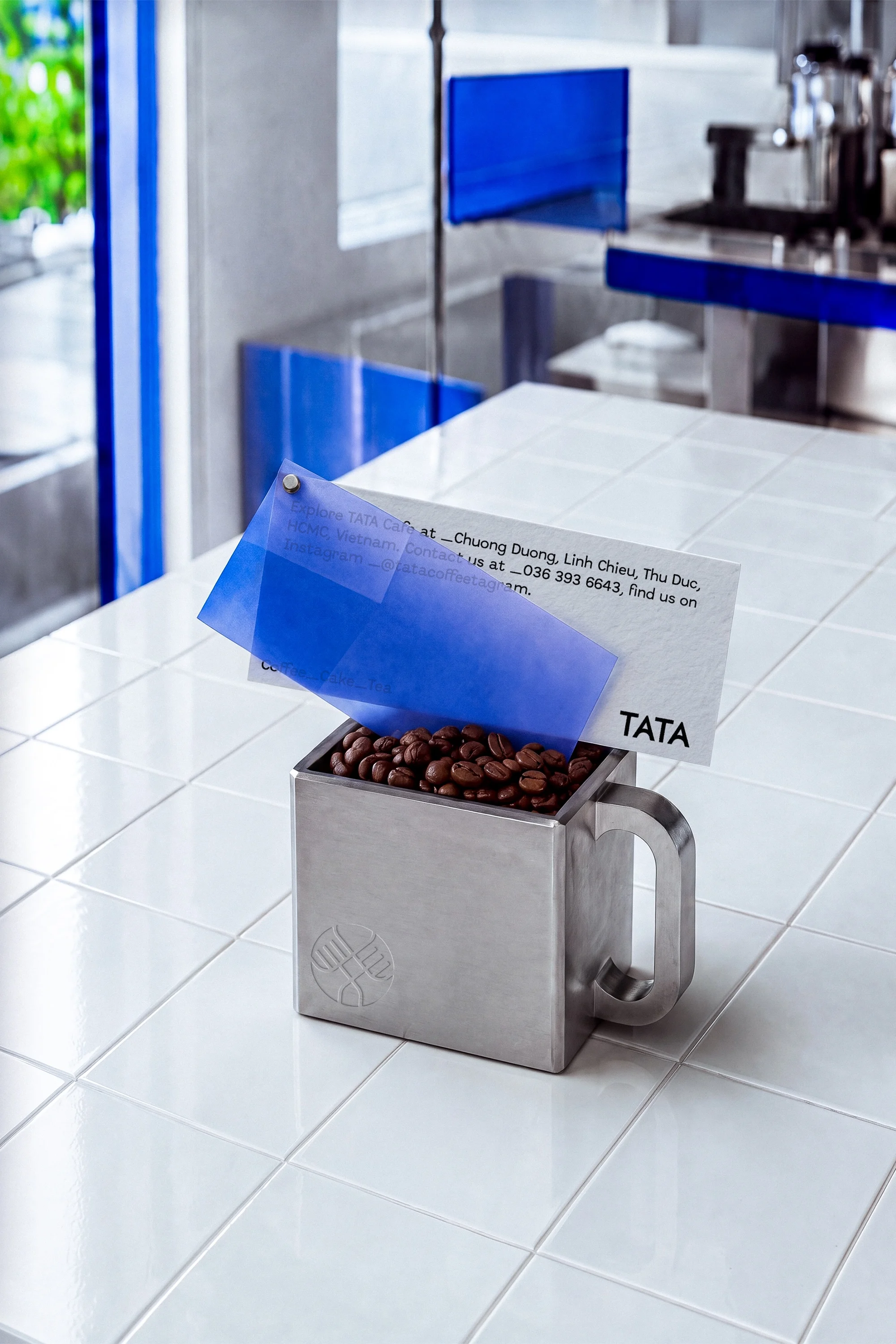


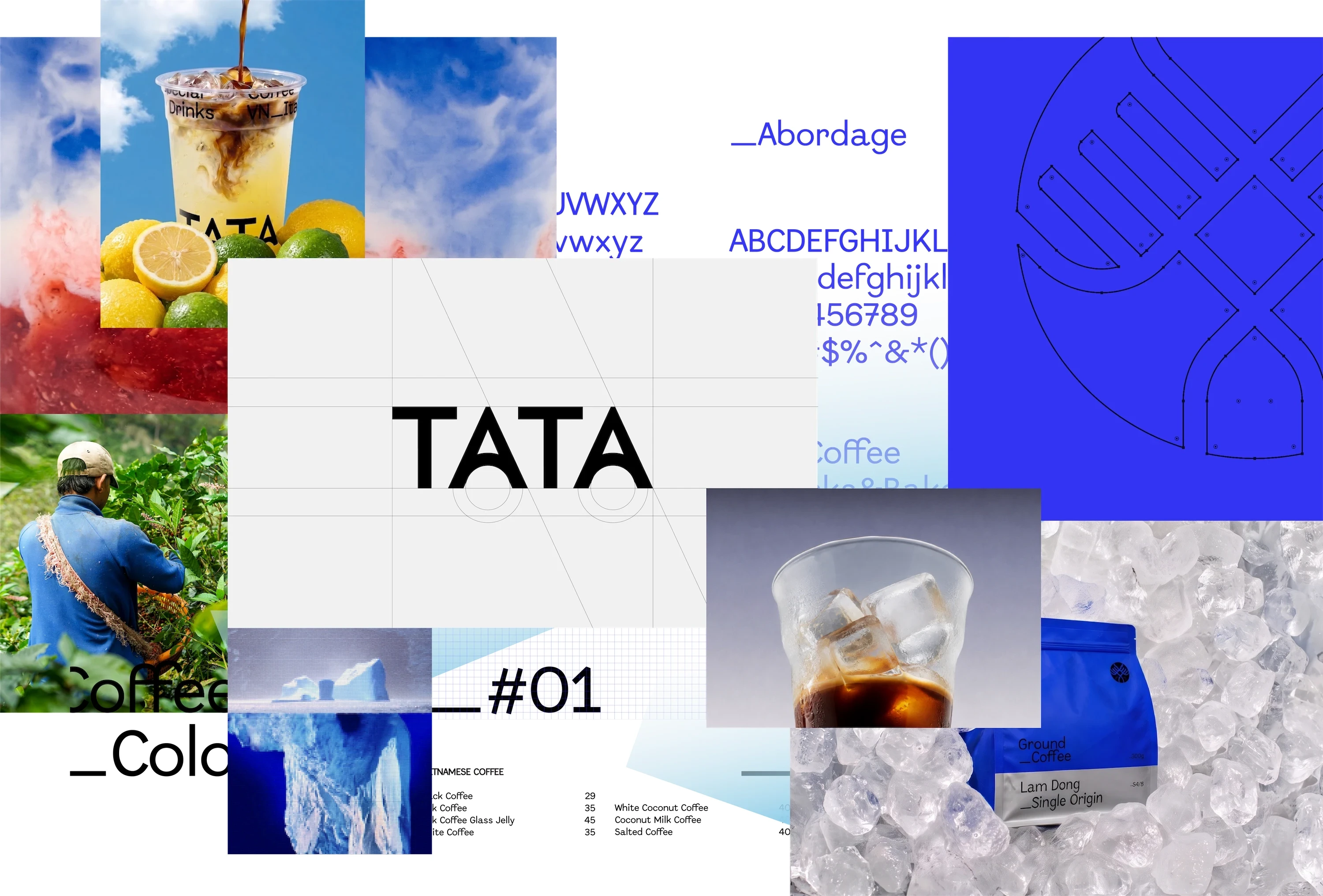
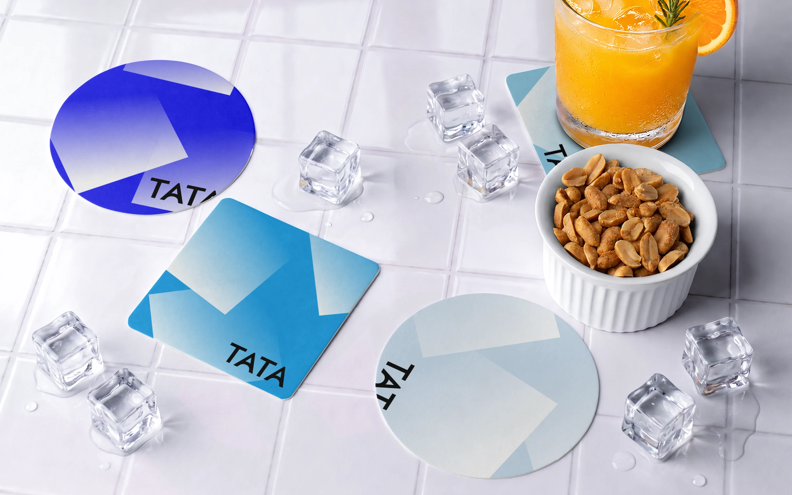
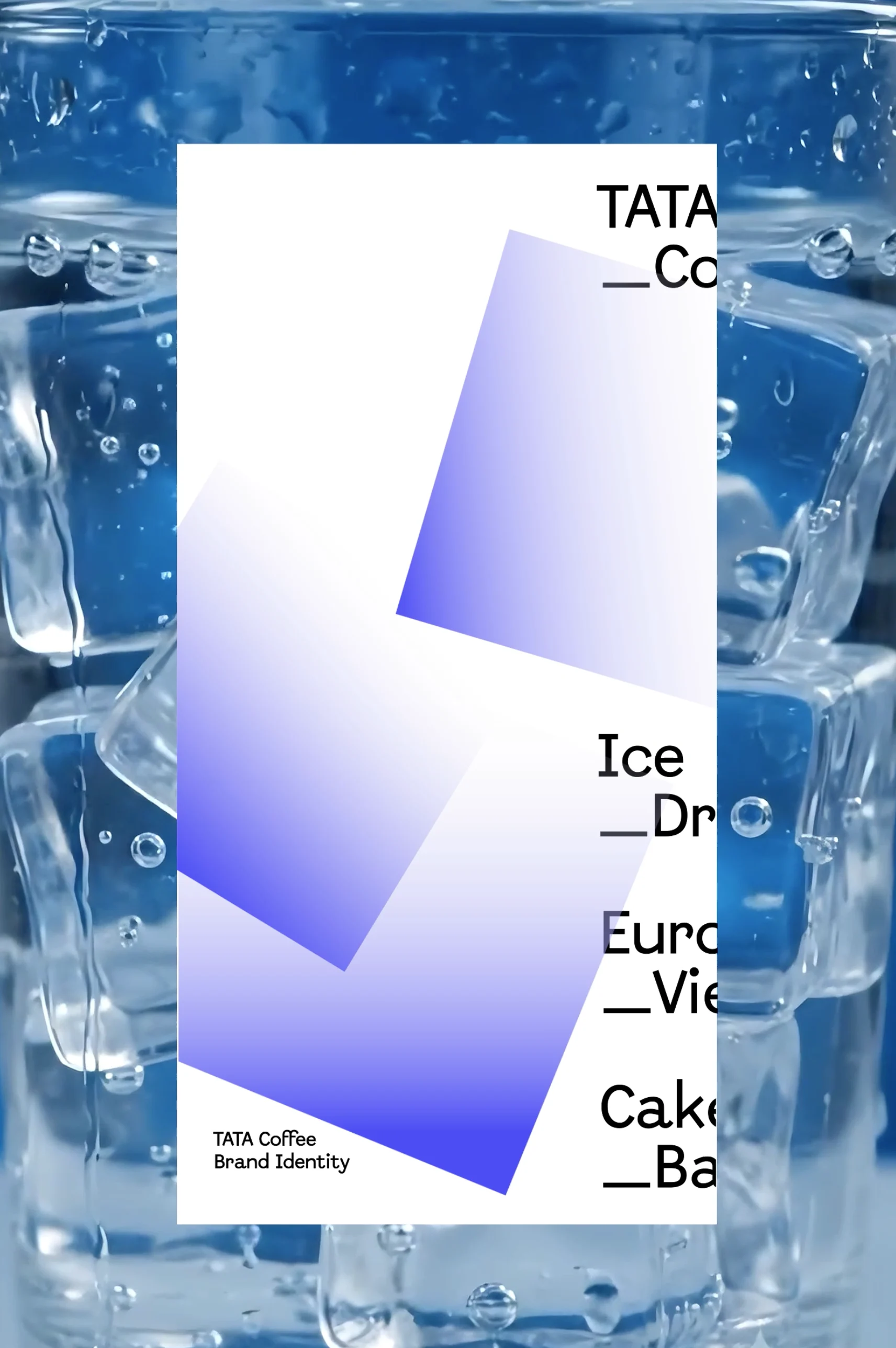
TATA’s visual language is built around two core systems: Ice Cubes and Stacked Landscapes. Both draw from the visual characteristics of Nordic ice and landscapes.
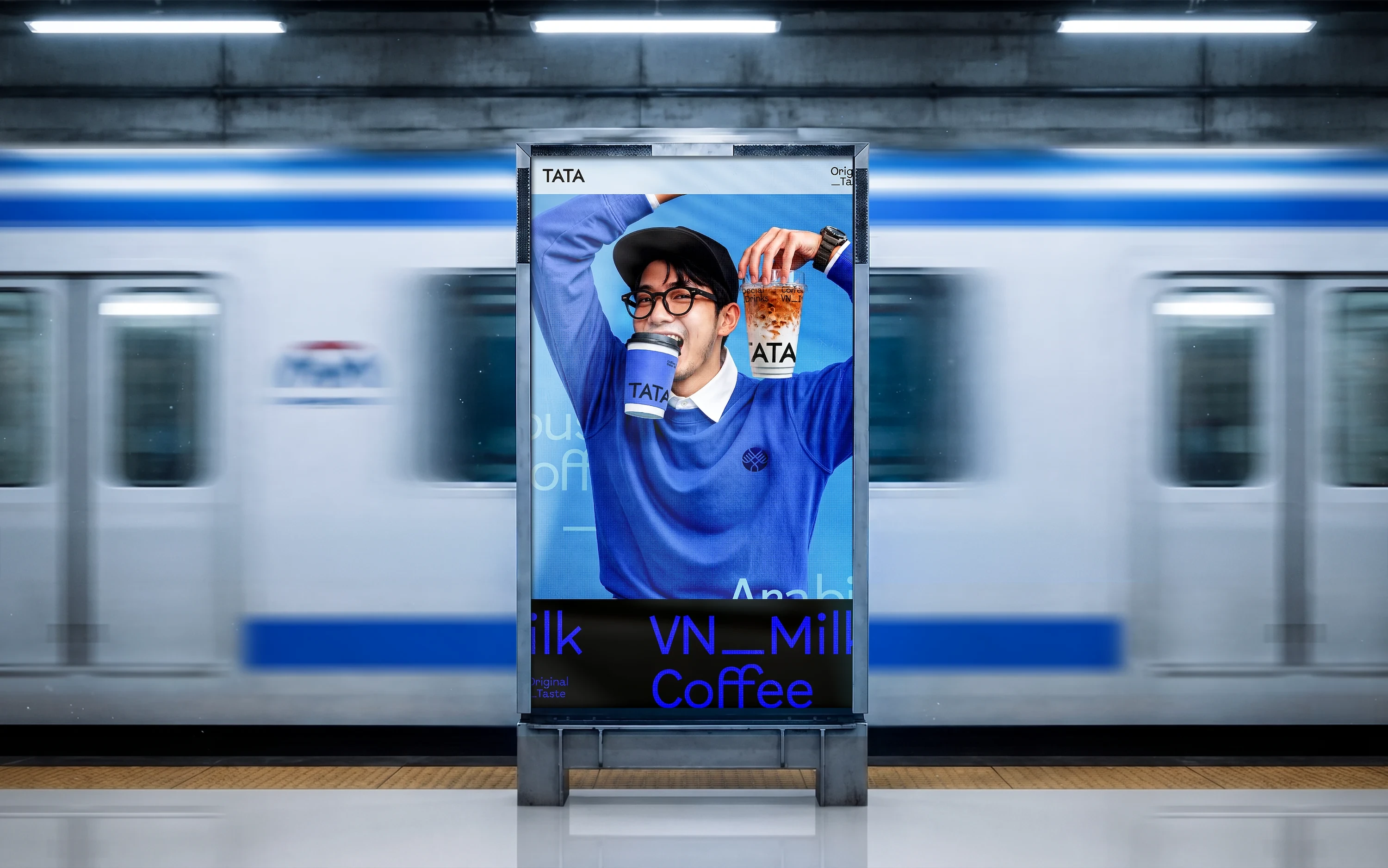
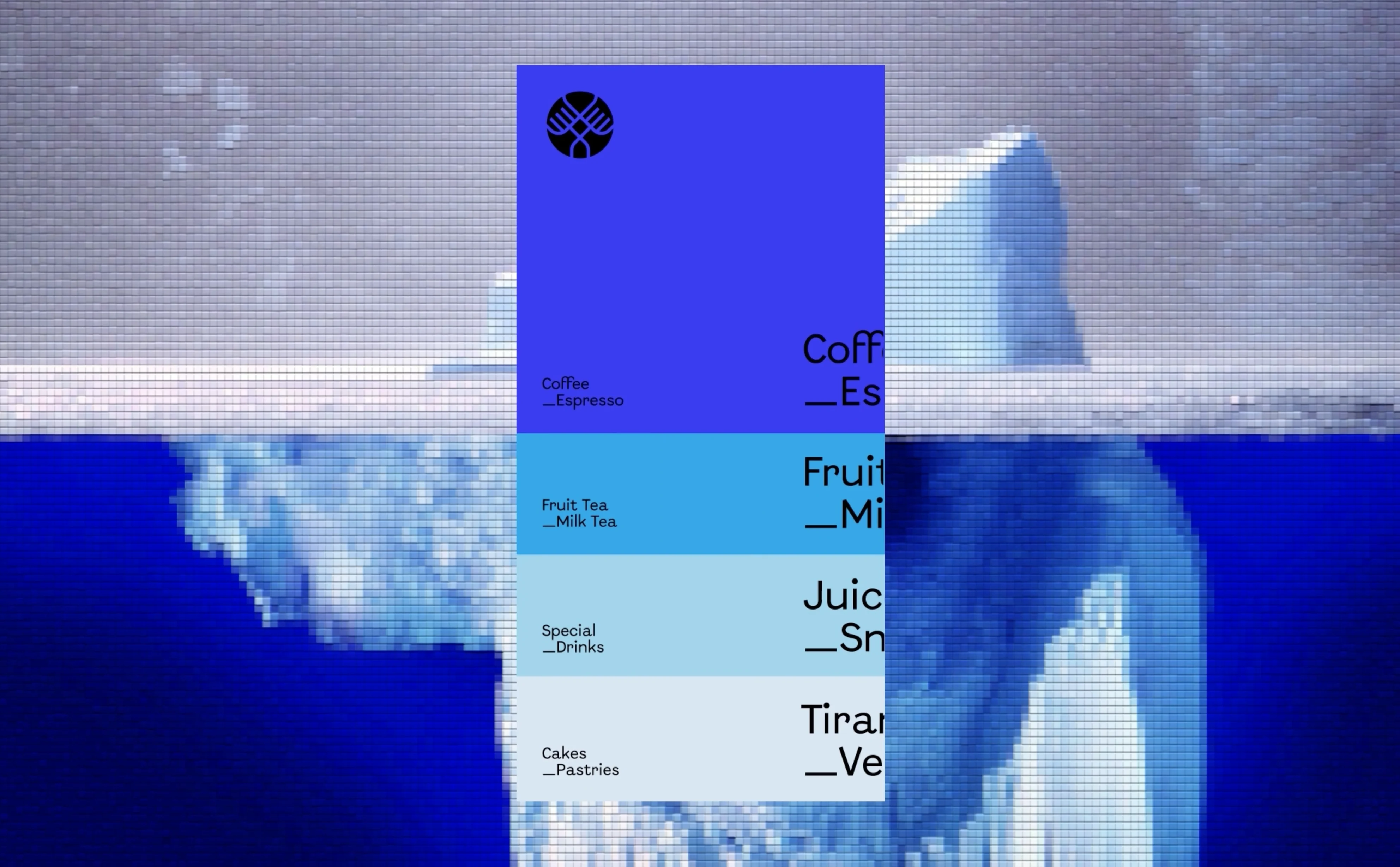
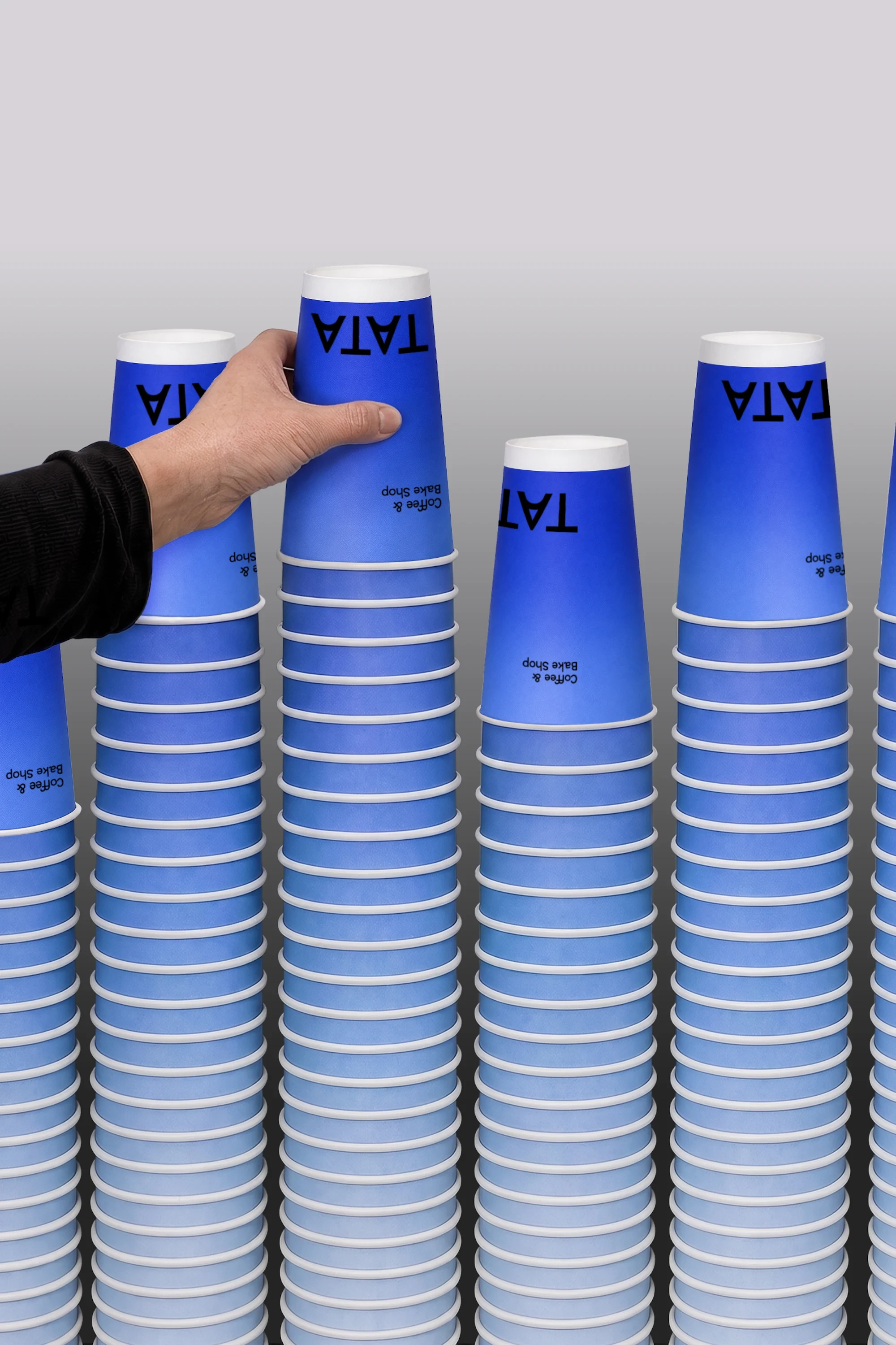
(TREATMENT) The Ice Cubes pattern uses gradient squares inspired by ice in a glass, referencing Vietnam’s iced-drink culture across packaging and digital applications. The Stacked Landscapes system layers graduated blues to evoke Nordic ice and mountains, adding depth and editorial hierarchy. White and blue acrylic, glass, and transparent materials extend the “ice” concept, while digital push-up effects reinforce TATA’s crystalline visual identity.
(Key features)
• Ice-inspired graphic system • Nordic stacked landscape visuals • Crystalline material & digital effects • Layered underscore typography
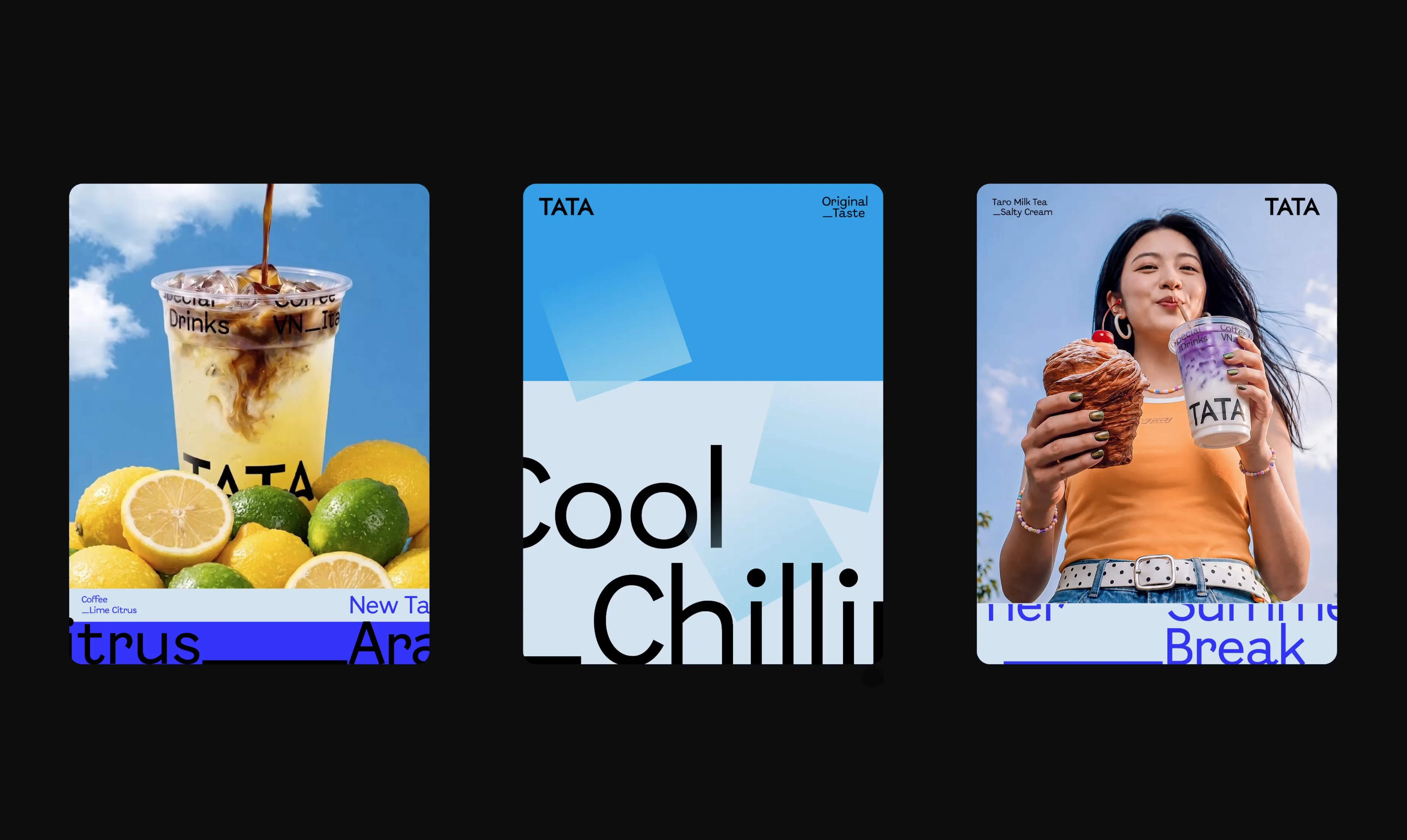
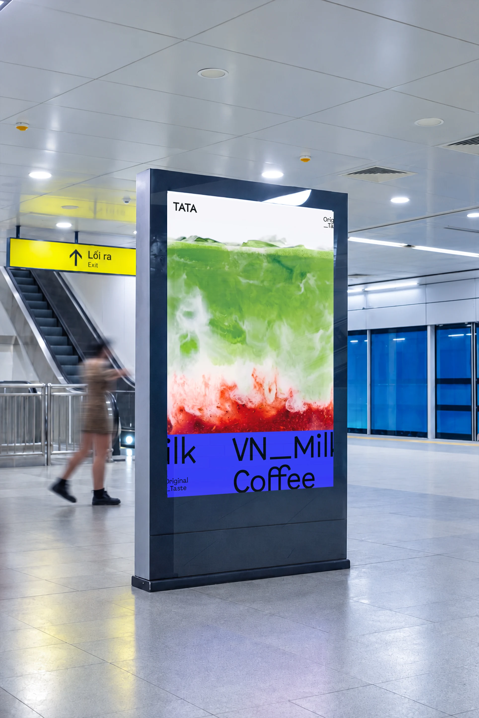
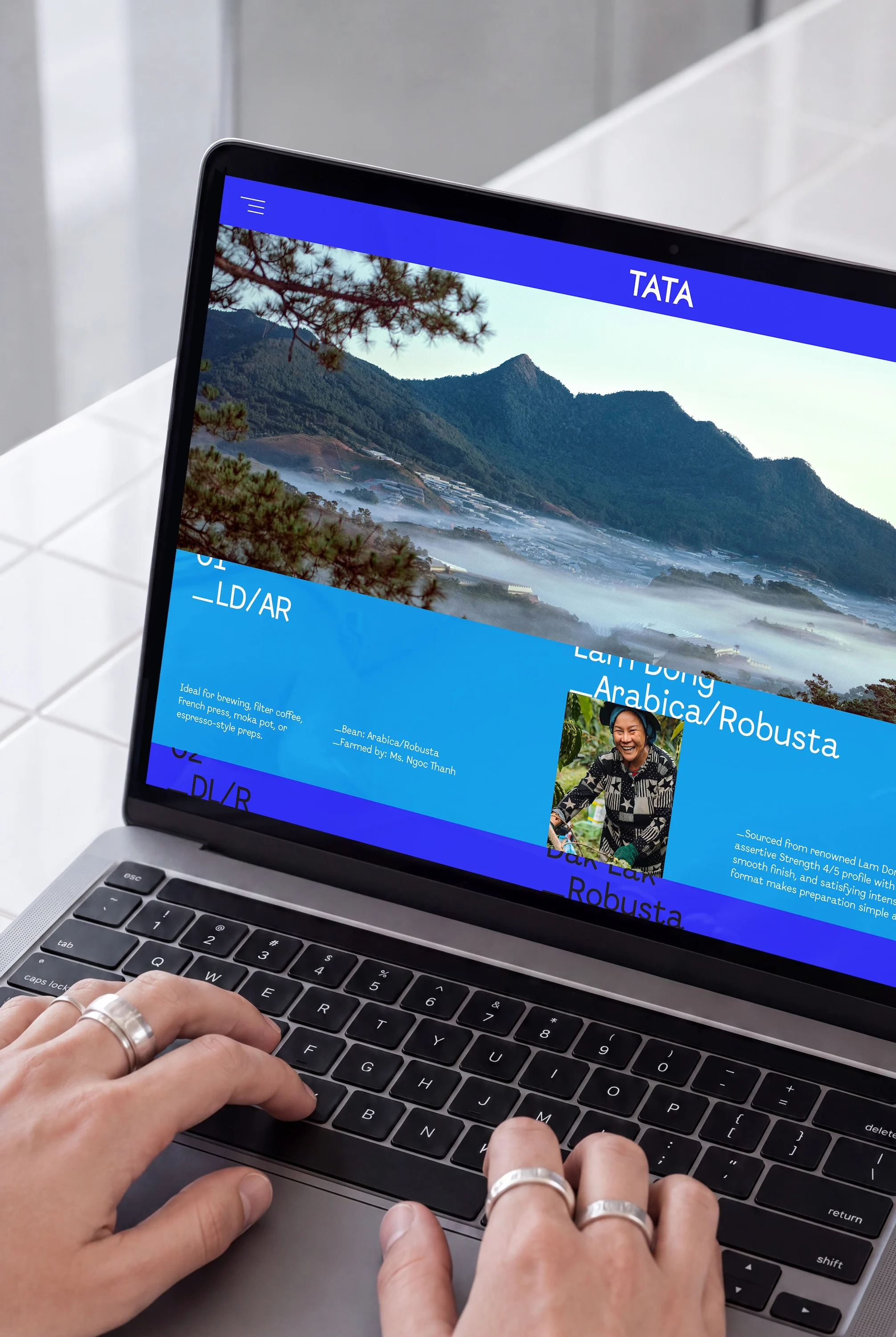
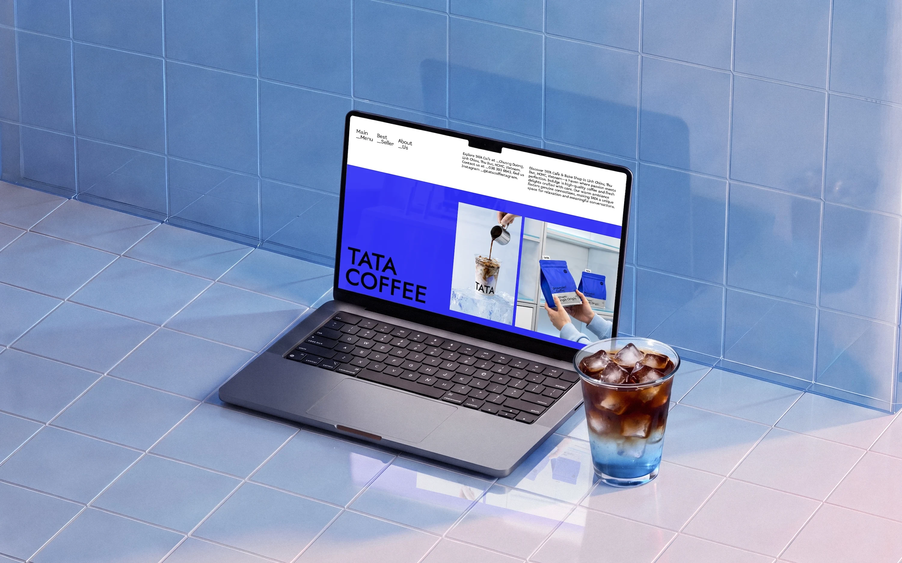


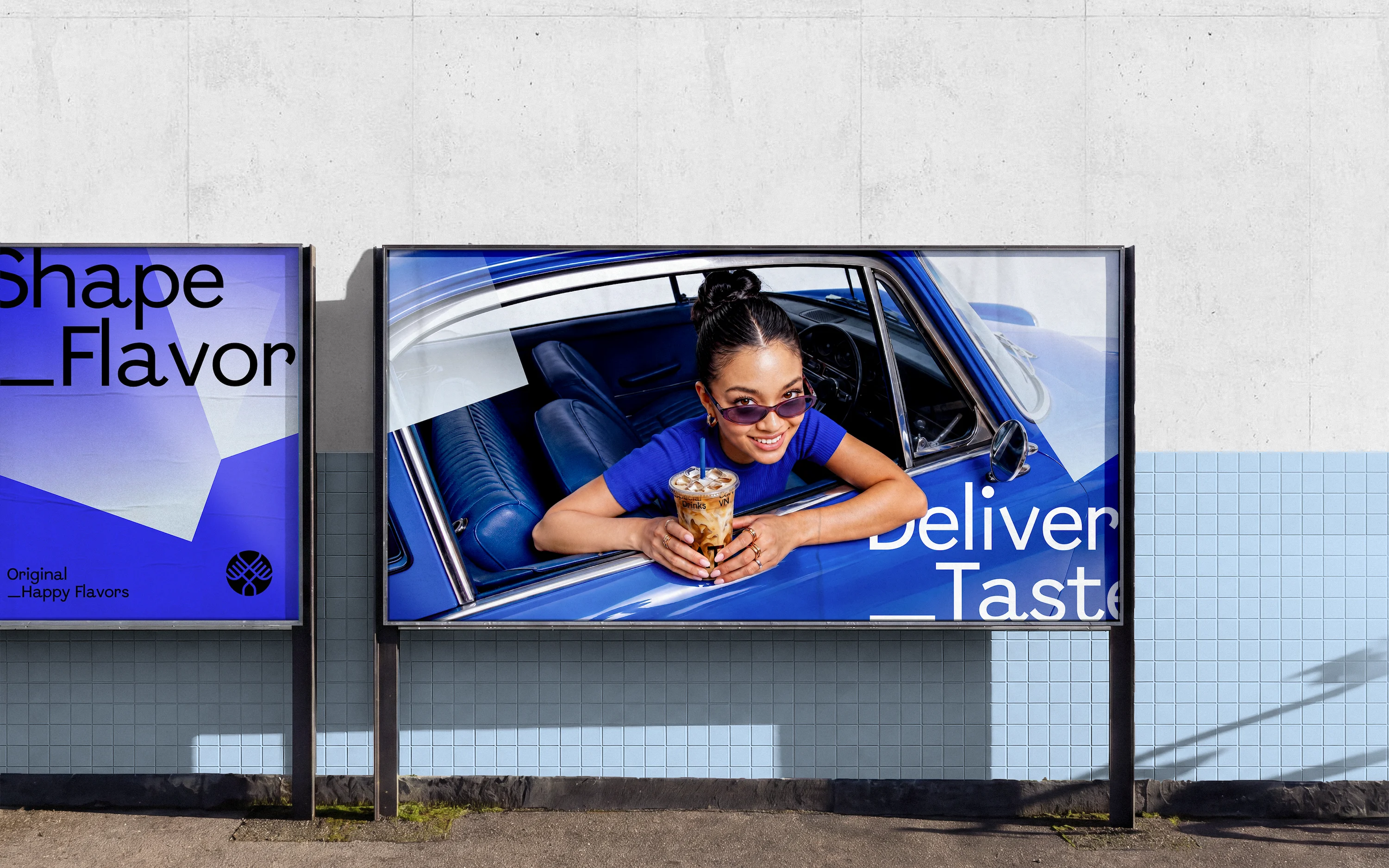
The “Layer of Warmth” Typography & Photography system balances the coolness of the color palette with the warmth of the brand experience.
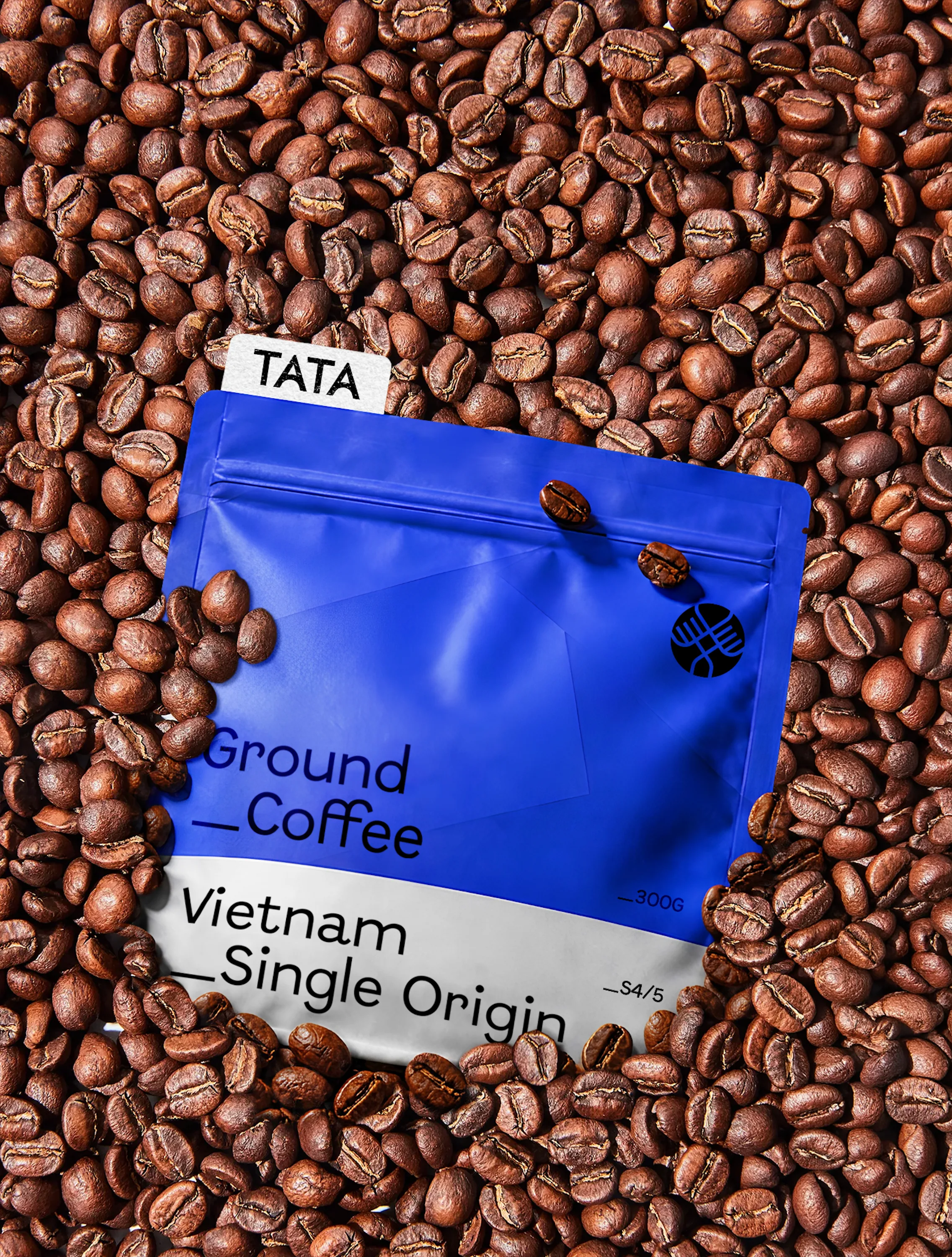
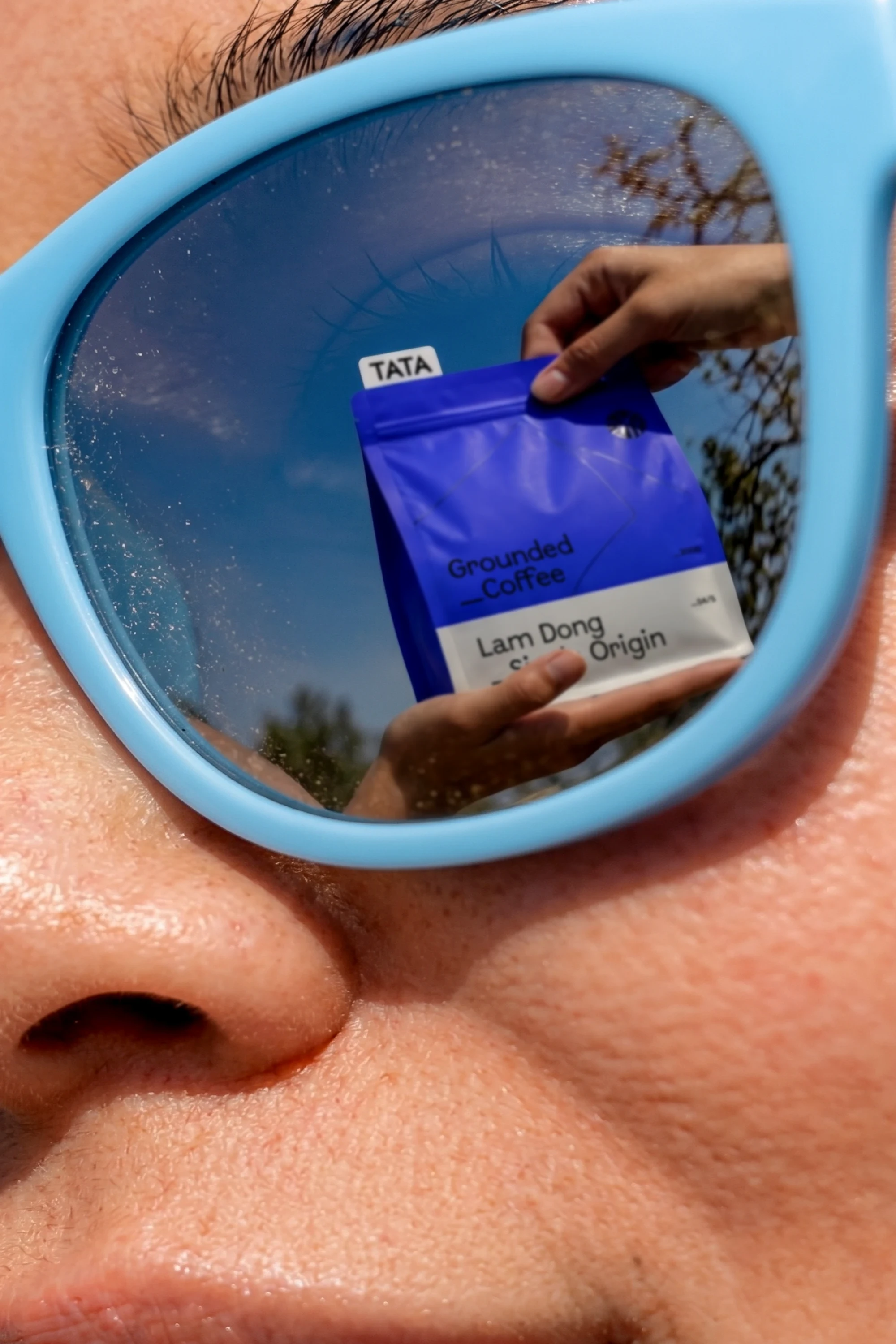
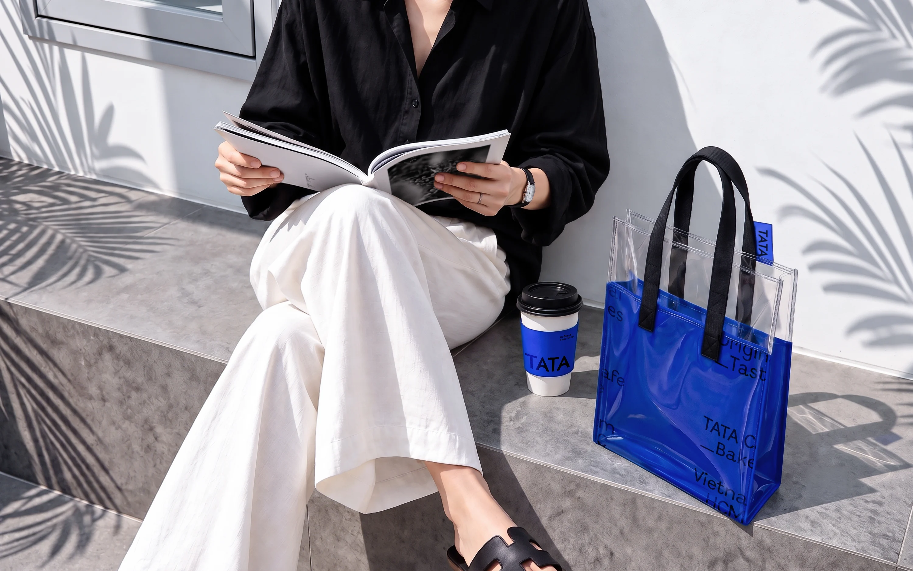
(APPROACH) Flush-left typography and underscores create layered messages inspired by Nordic ice formations, turning copy into evolving expressions such as Interest_Habits,transforming an interest into a habit. Photography is bright, clear, positive, and contemporary, creating a warm counterpoint to the identity’s cool color palette, while TATA’s products act as consistent visual anchors for brand recognition.
(Key features)
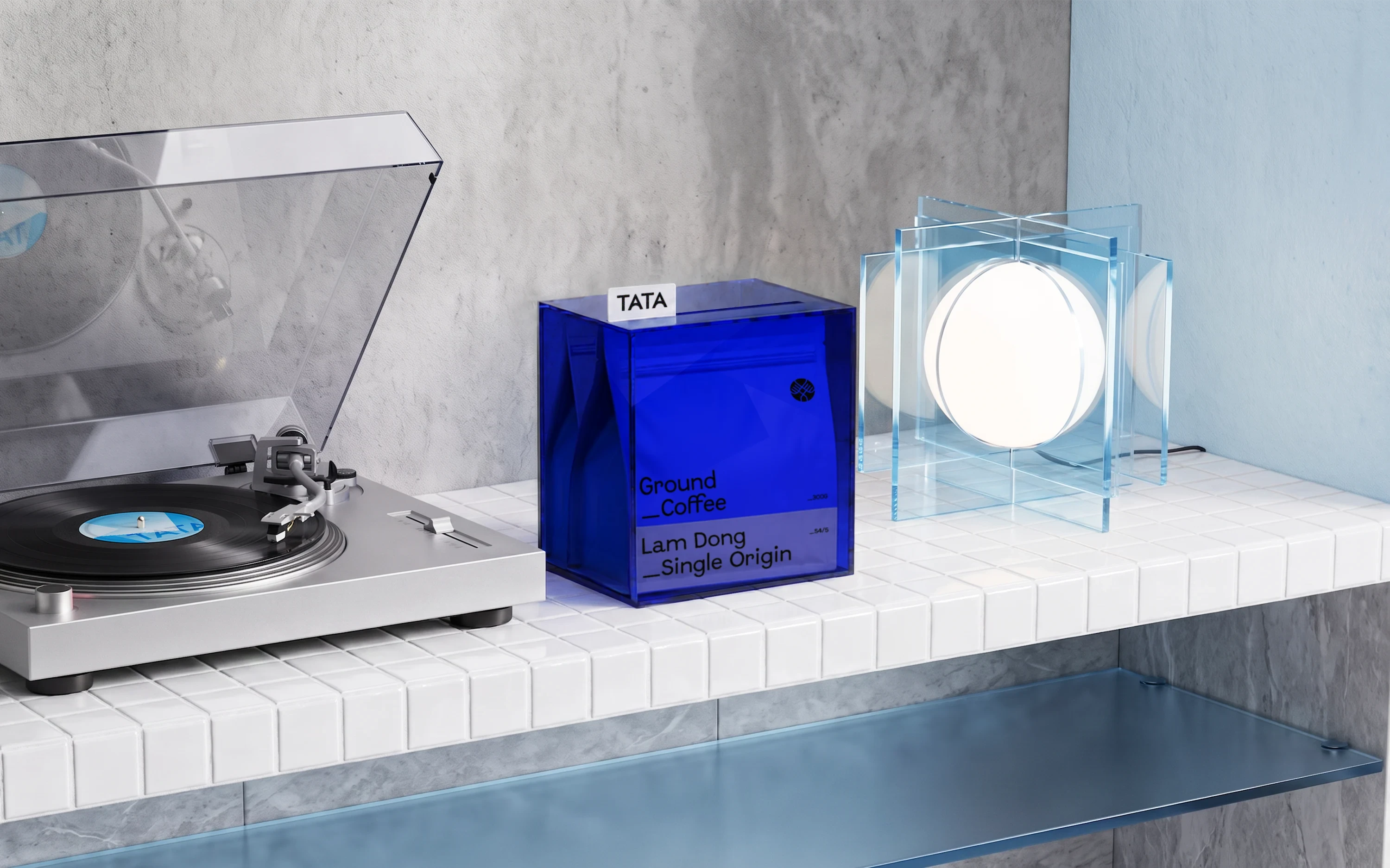
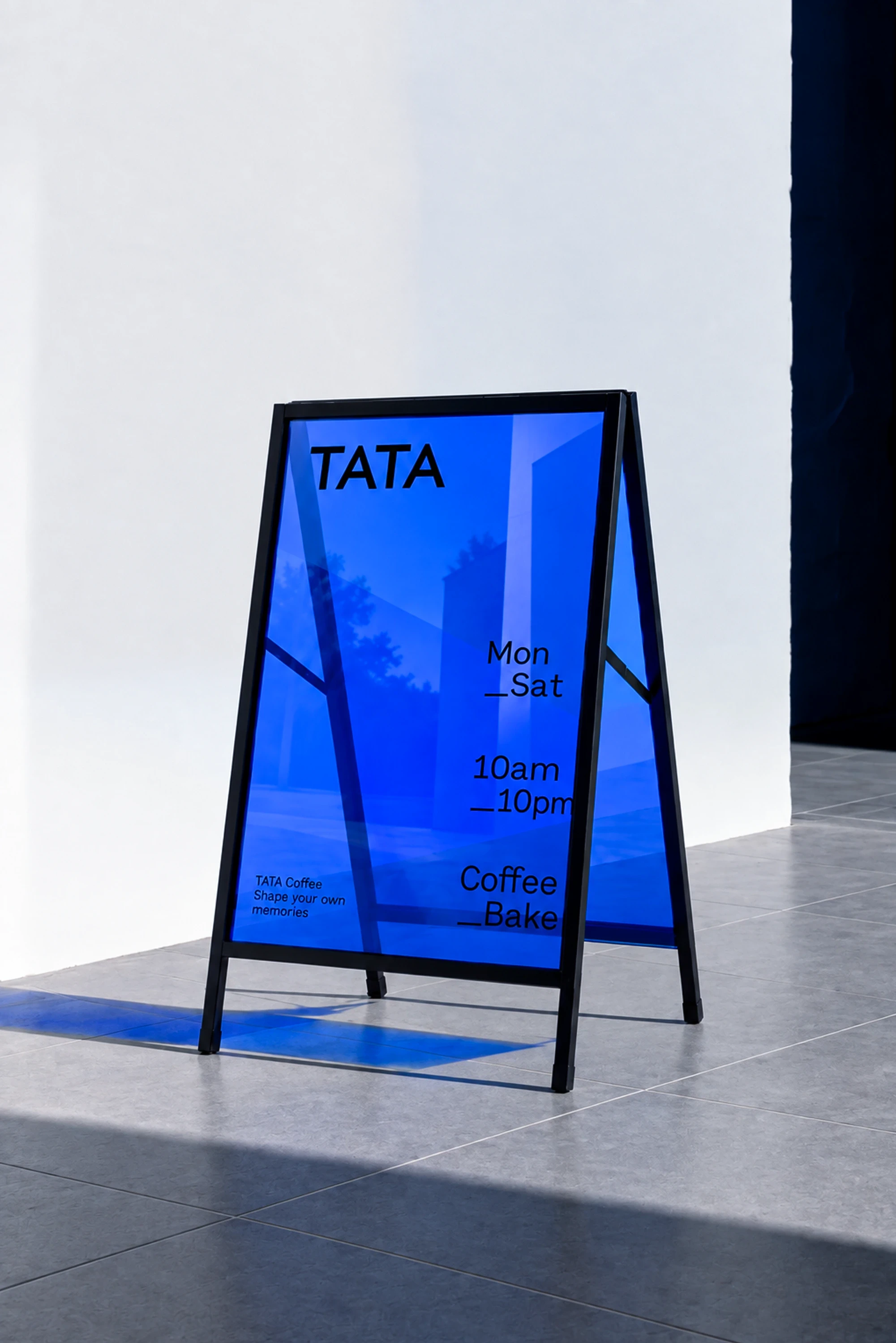

Layơ Lab positioned TATA as a contemporary F&B brand where Scandinavian minimalism meets everyday Vietnamese warmth.
Client: TATA Coffee Year: 2022 Creative Direction: Alex Dang Design: Thanh Nguyen, Danson Vu Account: Hang Nguyen